Monday, December 15, 2008

Federal Reserve Balance Sheet

Each week, the Federal Reserve posts the current release of Release H.4.1. at this link. This release is titled Factors Affecting Reserve Balances and shows the current numbers from what is commonly called the Federal Reserve Balance Sheet. There is a description of the Federal Reserve Balance Sheet at Econbrowser.


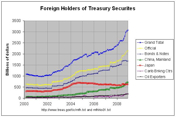
In addition to the weekly release, the Federal Reserve posts historical data going back to December 18, 2002. Tables 1 through 7 contain the weekly averages and tables 8 through 14 contain the corresponding data for each Wednesday. The weekly averages are the data that is most often referenced in the weekly H.4.1 release and elsewhere so that is what I look at in the remainder of this post. The following graph shows the composition of assets on the Federal Reserve Balance Sheet from 2003 through 2008:


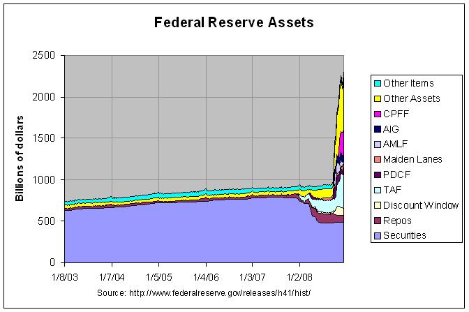
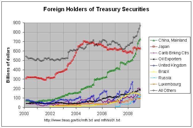
The actual numbers and sources for this and the following graph can be found at this link. As can be seen, the total assets rose slowly but steadily through 2007 and consisted chiefly of securities. The numbers at the above link show that those securities, in turn, consisted chiefly (currently over 97 percent) of U.S. Treasuries. Starting in early 2008, many of these securities began to be replaced by other assets, most notably those in the TAF (Term Auction Facility), Repos (Repurchase Agreements) and other assets. This can be seen in more detail in the following graph showing just 2008:


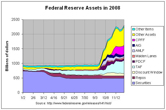
As can be seen, total assets began to increase rapidly in September of 2008. The largest contributors to this increase were TAF, CPFF (Commercial Paper Funding Facility), and Other Assets. According to the aforementioned Econbrowser post, currency swaps are probably the biggest single item of "other Federal Reserve assets". In any event, the above graph shows the confusing array of acronyms signifying programs which are now making significant contributions to the Federal Reserve Balance Sheet. Following is a list of those and some related acronyms with links to following text that describe them:


Key to Acronyms and Terms
-------------------------
AIG American International Group
AMLF Asset-Backed Commercial Paper (ABCP) Money Market Mutual Fund (MMMF) Liquidity Facility
CPFF Commercial Paper Funding Facility
Discount Window
ML Maiden Lane LLC
ML III Maiden Lane III LLC
MMIFF Money Market Investor Funding Facility
PDCF Primary Dealer Credit Facility
Repos Repurchase Agreements
RP Repurchase Agreements
RRP Reverse Repurchase Agreements
TAF Term Auction Facility
TALF Term Asset-Backed Securities Loan Facility
TARP Troubled Assets Relief Program
TSLF Term Securities Lending Facility


Note: Securities currently consist almost entirely (over 97 percent) of U.S Treasuries.
Other Items include Gold Stock, Special drawing rights certificate account,
Treasury currently outstanding, and Float.


American International Group


The Federal Reserve Board on Tuesday, [September 16, 2008] with the full support of the Treasury Department, authorized the Federal Reserve Bank of New York to lend up to $85 billion to the American International Group (AIG) under section 13(3) of the Federal Reserve Act. The secured loan has terms and conditions designed to protect the interests of the U.S. government and taxpayers.


The Board determined that, in current circumstances, a disorderly failure of AIG could add to already significant levels of financial market fragility and lead to substantially higher borrowing costs, reduced household wealth, and materially weaker economic performance.


The purpose of this liquidity facility is to assist AIG in meeting its obligations as they come due. This loan will facilitate a process under which AIG will sell certain of its businesses in an orderly manner, with the least possible disruption to the overall economy.


Asset-Backed Commercial Paper Money Market Mutual Fund Liquidity Facility


The Asset-Backed Commercial Paper Money Market Mutual Fund Liquidity Facility is a lending facility that provides funding to U.S. depository institutions and bank holding companies to finance their purchases of high-quality asset-backed commercial paper (ABCP) from money market mutual funds under certain conditions. The program is intended to assist money funds that hold such paper in meeting demands for redemptions by investors and to foster liquidity in the ABCP market and money markets more generally.


Commercial Paper Funding Facility


The Federal Reserve created the Commercial Paper Funding Facility (CPFF) to provide a liquidity backstop to U.S. issuers of commercial paper. The CPFF is intended to improve liquidity in short-term funding markets and thereby contribute to greater availability of credit for businesses and households. Under the CPFF, the Federal Reserve Bank of New York will finance the purchase of highly rated unsecured and asset-backed commercial paper from eligible issuers via eligible primary dealers.


Discount Window


When the Federal Reserve System was established in 1913, lending reserve funds through the Discount Window was intended as the principal instrument of central banking operations. Although the Window was long ago superseded by open market operations as the most important tool of monetary policy, it still plays a complementary role. The Discount Window functions as a safety valve in relieving pressures in reserve markets; extensions of credit can help relieve liquidity strains in a depository institution and in the banking system as a whole. The Window also helps ensure the basic stability of the payment system more generally by supplying liquidity during times of systemic stress.


Maiden Lane LLC


On June 26, 2008, the Federal Reserve Bank of New York (FRBNY) extended credit to Maiden Lane LLC under the authority of section 13(3) of the Federal Reserve Act. This limited liability company was formed to acquire certain assets of Bear Stearns and to manage those assets through time to maximize repayment of the credit extended and to minimize disruption to financial markets. Payments by Maiden Lane LLC from the proceeds of the net portfolio holdings will be made in the following order: operating expenses of the LLC, principal due to the FRBNY, interest due to the FRBNY, principal due to JPMorgan Chase & Co., and interest due to JPMorgan Chase & Co. Any remaining funds will be paid to the FRBNY.


Maiden Lane III LLC


On November 25, 2008, the Federal Reserve Bank of New York (FRBNY) began extending credit to Maiden Lane III LLC under the authority of section 13(3) of the Federal Reserve Act. This limited liability company was formed to purchase multi-sector collateralized debt obligations (CDOs) on which the Financial Products group of the American International Group, Inc. (AIG) has written credit default swap (CDS) contracts. In connection with the purchase of CDOs, the CDS counterparties will concurrently unwind the related CDS transactions. Payments by Maiden Lane III LLC from the proceeds of the net portfolio holdings will be made in the following order: operating expenses of Maiden Lane III LLC, principal due to the FRBNY, interest due to the FRBNY, principal due to AIG, and interest due to AIG. Any remaining funds will be shared by the FRBNY and AIG.


Money Market Investor Funding Facility


The Money Market Investor Funding Facility (MMIFF), authorized by the Board under Section 13(3) of the Federal Reserve Act, will support a private-sector initiative designed to provide liquidity to U.S. money market investors. Under the MMIFF, the New York Fed will provide senior secured funding to a series of special purpose vehicles to facilitate an industry-supported private-sector initiative to finance the purchase of eligible assets from eligible investors.


Primary Dealer Credit Facility


The Primary Dealer Credit Facility (PDCF) is an overnight loan facility that provides funding to primary dealers in exchange for a specified range of eligible collateral and is intended to foster the functioning of financial markets more generally.


Repurchase and Reverse Repurchase Agreements


The Fed uses repurchase agreements, also called "RPs" or "repos", to make collateralized loans to primary dealers. In a reverse repo or “RRP”, the Fed borrows money from primary dealers. The typical term of these operations is overnight, but the Fed can conduct these operations with terms out to 65 business days.


The Fed uses these two types of transactions to offset temporary swings in bank reserves; a repo temporarily adds reserve balances to the banking system, while reverse repos temporarily drains balances from the system.


Repos and reverse repos are conducted with primary dealers via auction. In a repo, dealers bid on borrowing money versus various types of general collateral. In a reverse repo, dealers offer interest rates at which they would lend money to the Fed versus the Fed’s Treasury general collateral, typically Treasury bills.


Term Auction Facility


Under the Term Auction Facility (TAF), the Federal Reserve will auction term funds to depository institutions. All depository institutions that are eligible to borrow under the primary credit program will be eligible to participate in TAF auctions. All advances must be fully collateralized. Each TAF auction will be for a fixed amount, with the rate determined by the auction process (subject to a minimum bid rate). Bids will be submitted by phone through local Reserve Banks.


Term Asset-Backed Securities Loan Facility


The Term Asset-Backed Securities Loan Facility (TALF) is a funding facility that will help market participants meet the credit needs of households and small businesses by supporting the issuance of asset-backed securities (ABS) collateralized by student loans, auto loans, credit card loans, and loans guaranteed by the Small Business Administration (SBA). Under the TALF, the Federal Reserve Bank of New York (FRBNY) will lend up to $200 billion on a non-recourse basis to holders of certain AAA-rated ABS backed by newly and recently originated consumer and small business loans. The FRBNY will lend an amount equal to the market value of the ABS less a haircut and will be secured at all times by the ABS. The U.S. Treasury Department--under the Troubled Assets Relief Program (TARP) of the Emergency Economic Stabilization Act of 2008--will provide $20 billion of credit protection to the FRBNY in connection with the TALF.


Troubled Assets Relief Program


Treasury today [October 14, 2008] announced a voluntary Capital Purchase Program to encourage U.S. financial institutions to build capital to increase the flow of financing to U.S. businesses and consumers and to support the U.S. economy.


Under the program, Treasury will purchase up to $250 billion of senior preferred shares on standardized terms as described in the program's term sheet. The program will be available to qualifying U.S. controlled banks, savings associations, and certain bank and savings and loan holding companies engaged only in financial activities that elect to participate before 5:00 pm (EDT) on November 14, 2008. Treasury will determine eligibility and allocations for interested parties after consultation with the appropriate federal banking agency.


Term Securities Lending Facility


The Term Securities Lending Facility (TSLF) is a weekly loan facility that promotes liquidity in Treasury and other collateral markets and thus fosters the functioning of financial markets more generally. The program offers Treasury securities held by the System Open Market Account (SOMA) for loan over a one-month term against other program-eligible general collateral. Securities loans are awarded to primary dealers based on a competitive single-price auction.


All but one of the above descriptions come from the Federal Reserve. That one exception is TARP since it is in fact a Treasury program. Of course, it would make sense to also read commentary from outside sources on these programs. However, it seems that the institutions that are running the programs are the logical place to start.

Tuesday, November 18, 2008

Major Foreign Holders of Treasury Securities


Note: An updated version of the following post can be found at this link.


Each month, the Treasury Department posts updated estimates of the foreign holdings of U.S Treasuries by country at this link. It also posts estimates going back to March 2000 at this link. The following graph shows the totals for all countries by the type of treasury security and the totals for the three countries with the largest holdings.


The purple line shows the grand total of all treasury securities held by all foreign countries, private and public. As can be seen, it has been increasing steadily since early 2002 and has accelerated somewhat in the past year. The yellow line shows those securities held by "official institutions", defined on page 7 of the Report on U.S. Portfolio Holdings of Foreign Securities at End-Year 2004 as follows:


Official institutions consist primarily of national government and multinational institutions involved in the formulation of international monetary policy, but also include national government-sponsored investment funds and other national government institutions. Data on such institutions are collected separately because the motivations behind holdings of official institutions may differ from those of other investors.


The dark blue line just below the yellow line shows the totals for bonds and notes which are that portion of the total securities that are long-term debt securities, with an original
maturity of over one year. More details on short-term and long-term debt securities can be found on page 7 of the Report on U.S. Portfolio Holdings of Foreign Securities at End-Year 2007.


The other three lines show the holdings of the three countries with the largest holdings. These can be seen in more detail in the following graph which shows the holdings of the eight countries with the largest holdings:


The actual numbers and sources for both of the above graphs can be found at this link. As can be seen, the holdings of Mainland China has risen steadily since early 2002, increasing about seven-fold from $76.5 billion in February of 2002 to $541 billion now. It appears that they are just about to pass up Japan as the largest foreign holder of Treasuries. In fact, Japan's holdings reached a maximum of $699.4 billion in August of 2005 and have fallen to $585.9 billion now. Also, I noticed a few other interesting things in the data. The United Kingdom's holdings have soared from $50 billion in June of 2007 to $307.4 billion now. However, there seems to be a large discontinuity between each annual survey for the United Kingdom causing a large saw-tooth effect in the graph. If anyone knows the reason for this, please leave a comment.


In any case, there are a number of other countries whose holdings have increased rapidly for some portion of the past eight years. The holding of Oil Exporters have more than quadrupled from $43.9 billion in January of 2004 to $179.8 billion now. The holdings of Brazil have gone up by a factor of ten from $14 billion in January of 2005 to $146.2 billion now. The most recent rapid increase has been in the holdings of Russia which has gone up by a factor of ten from $7.4 billion in March of 2007 to $74.4 billion now. I would guess that most of this investment from Oil Exporters, Brazil, and Russia came from income from resources, chiefly oil. With oil having fallen from a high of $147 per barrel last July to below $56 a barrel now, it would seem likely that future investment in Treasuries by these nations will fall. In addition, it would seem possible that China's future investment will fall due to its recently reported plan to implement a stimulus program of over a half-trillion dollars.


This does seem worrisome. I'm not an expert on the auction of Treasuries but it would seem that there is at least a risk of a significant rise in the interest rate that we have to pay on Treasuries. Due to the current flight to safety and strength in the dollar, this may not occur immediately. But it would seem to be a serious risk in the future. That risk is mentioned in this article.


This is all the more a concern because most of the increase in the public debt has been financed by foreign investors in recent years. From 2001 to 2007, the total public debt increased $1.716 trillion and the foreign-held public debt increased $1.235 trillion (see here). Hence, in effect, about 72 percent of the total increase in the public debt since 2001 has been borrowed from foreign sources.

Monday, November 3, 2008

Distribution of Family Net Worth (Part 2)

My prior post looked at the distribution of net worth according to the 2004 Survey of Consumer Finances. As mentioned, net worth appears to be heavily skewed such that about 80 percent of families had a net worth that was less than the average from 1989 to 2004. Whereas that result came from looking at net worth by percentiles of net worth, the following graph looks at net worth by percentile of income:


The actual numbers and their sources can be found at this link. As can be seen, there is a positive correlation between net worth and income. That is, those with higher income tend to have a higher net worth. The data also shows that the median net worth of the top ten percent of income earners more than doubled from 1995 to 2004. The median net worth of the 80 to 90 percentile nearly doubled and the net worth of the 60 to 80 percentile went up about 71 percent during that period. The median net worth of the other 60 percent of income earners gained much less with the net worth of the 20 to 40 percentile actually decreasing by over 18 percent.


The following graph looks at family net worth by the age in years of the family head:


As before, the actual numbers and their sources can be found at this link. The graph shows that the median net worth is relatively low for families whose head is under 35 but grows steadily until the head is 65 years or older. At that point, net worth starts to slowly drop off. However, even the median net worth of families whose head is 75 or more is generally more than it is for families whose head is 45 to 54 years of age. Hence, net worth does not drop off that quickly.


The following graph looks at family net worth by the education level of the family head:


As can be seen, the median net worth of families whose head is a college graduate is much higher than it is for other families. This net worth increased by over 75 percent from 1995 to 2004 while the median net worth of all other families stayed about the same. Still, families whose head had a high-school diploma had a much higher net worth than those who did not. In fact, the median net worth of families whose head did not have a high-school diploma dropped by 42 percent from 1989 to 2004. Hence, it appears that higher education is becoming a more important determinant of a family's net worth.


There are a couple of other interesting facts apparent from the table at this link. One is that the median net worth of white non-hispanic families is far above that of nonwhite or hispanic families. It has narrowed somewhat going from about 10.6 times as large in 1989 to 5.7 times as large in 2004. In addition, the median net worth of nonwhite or hispanic families has increased by about 2.5 times over that period, from about $9.8 thousand in 1989 to $24.8 thousand in 2004. Still, a large differential remains.


The second fact is that home owners have a much higher median net worth than renters. In fact, renters had a lower median net worth than any other group in the table, including nonwhite or hispanic families. That net worth ranged from $2.9 thousand in 1989 to $6 thousand in 1995.

Monday, October 20, 2008

Distribution of Family Net Worth

NOTE: AN UPDATED VERSION OF THIS PAGE CAN BE FOUND AT this link

My prior post looked at household assets, liabilities, and net worth as given by the Federal Reserve's Quarterly Release Z.1, "Flow of Funds Accounts of the United States". While this report gives a good overview of household net worth in the United States, it gives no information about the distribution of that net worth. The only regular study of that distribution that I'm aware of is the Federal Reserve's Survey of Consumer Finances which is conducted every three years. The last one for which data has been released was in 2004. Data from the 2007 Survey of Consumer Finances is expected to be released in the first quarter of 2009.


Table 3 of the 2004 Survey of Consumer Finances gives family net worth, by selected characteristics of families, from the past six surveys (1989 through 2004). It gives both the mean and the median of the subgroups determined by these characteristics so it's important to understand the difference between these two terms. Briefly, the mean of a series of numbers is the "average", computed by dividing the sum of the numbers by the count of the numbers in the series. The median, on the other hand, is the "middle" value when the numbers are arranged in order of value. If there are an even number of values, it is the average of the two middle values. Hence, the series 1, 2, and 6 has a mean of 3 and a median of 2 and the series 1, 2, 3, and 6 has a mean of 3 and a median of 2.5. Note that in both of these cases, the mean is greater than the median. This is because the relatively high value of the last number in the series (the 6) pulls up the mean more than it does the median. This is important to remember in interpreting the numbers in table 3.


The following graph shows the median family net worth by percentiles of net worth:


The actual numbers and their sources can be found at this link. The above graph also shows the overall mean and median family net worth. Note that the overall mean is much higher than the median and is just below the median of the 75 to 90 percentile. This is due to the fact that, like the example above, the majority of families have a net worth less than the mean. In fact, the above graph would indicate that about 80 percent of families have a net worth that is less than the mean.


One useful thing about looking at the medians of percentiles is that the median represents the central percent of the percentile. That is, the medians of the 0 to 25, 25 to 50, 50 to 75, 75 to 90, and 90 to 100 percentiles represent the 12.5, 37.5, 62.5, 82.5, and 95 percentiles, respectively. That is because percentiles, like medians, are obtained by arranging the series by order of value. Hence, the data shows that 50 percent of families had a net worth less than $93,100 in 2004 and three-quarters of those families (37.5 percent of all families) had a net worth less than $43,600. This data shows that net worth is strongly skewed toward the bottom of the entire range of net worths held by families.


A very close look at the data shows that the mean surpasses the median only slightly in the 25 to 50, 50 to 75, and 75 to 90 percentiles. In the 0 to 25 percentile, the median actually surpassed the mean. Only in the 90 to 100 percentile does the mean greatly surpass the median. This suggests that the majority of the skewing of all of the data is due to the relatively high net worth of those in the 90 to 100 percentile, especially those in the upper portion of this range.


Distribution of Family Net Worth (Part 2)

Sunday, October 5, 2008

Balance Sheet of Households and Nonprofit Organizations

Every three months, the Federal Reserve releases Quarterly Release Z.1, "Flow of Funds Accounts of the United States". That release includes table B.100, titled "Balance Sheet of Households and Nonprofit Organizations". Following is a description of the households and nonprofit organizations sector from page 170 of the Guide to the Flow of Funds Accounts:


The households and nonprofit organizations sector consists of individual households (including farm households) and nonprofit organizations such as charitable organizations, private foundations, schools, churches, labor unions, and hospitals. Nonprofits account for about 6 percent of the sector’s total financial assets, according to recent estimates, but they own a larger share of some of the individual financial instruments held by the sector.


The following graph shows this sector's assets since 1952 in trillions of 2007 dollars:


The actual numbers and their sources can be found at this link. The values for 2008 are through the second quarter and all other values are through the end of the year. As can be seen, corporate equities peaked at the end of 1999 and are currently about where they were in 1994. Mutual funds and pension fund reserves likewise peaked in 1999 but are currently above that peak (though just barely for pension fund reserves).


The graph also shows that real estate started rising rapidly in about 1998 and peaked at the end of 2006. In retrospect, it does not seem surprising that this rapid increase proved to be unsustainable. In any case, the correction in real estate will hopefully be closer to that of mutual funds and pension fund reserves than of corporate equities. Being a somewhat more stable asset class, this would seem likely.


The following graph shows the total of all assets (the green line) and the total liabilities against those assets (the red line). It also shows the difference between these two values, net worth (the blue line):


As can be seen, real assets and net worth have fallen sharply in the first two quarters of 2008. In fact, real net worth is currently just slightly above the peak that it reached at the end of 1999.


The prior two graphs show assets and liabilities corrected for inflation. To estimate these values per-capita, one needs to divide them by the current population. The following graph shows the values in the prior graph divided by the year-end U.S. population:


As can be seen, real per-capita net worth is currently below the peak that it reached at the end of 1999. In fact, it's at about the level that it was the year before and the year after this peak.


Distribution of Family Net Worth


Distribution of Family Net Worth (Part 2)

Monday, September 22, 2008

Job Growth Under Bush and Prior Presidents (continued)

A reader of my prior post suggested that it takes time for an economic policy to have an effect and that the analysis of the effect of a president's policy should be lagged by two years. While the idea that some effects of a policy require a two-year lag has merit, I know of no evidence that all effects require the passage of two years to begin. Some effects may begin as soon the the election result or the passage of certain policies becomes known. Hence, the following table shows annual job growth with a one-year and two-year time lag as well as no time lag. In addition, it shows job growth if the first two years of a president's term are skipped, assuming that they are effected by both the prior and current president's policies. So as to skip as little time as possible, the table looks at job growth by party, combining consecutive terms where the presidency is held by the same party.

NONFARM AND HOUSEHOLD SURVEY EMPLOYMENT GROWTH BY PRESIDENTIAL PARTY (percent annualized)

Nonfarm Employment Growth Household Survey Employment Growth
----------------------------------- -----------------------------------
1-Year 2-Year 2-Year 1-Year 2-Year 2-Year
President Mo Year No Lag Lag Lag^ Skip^ No Lag Lag Lag Skip Party
----------- --- ---- -------- -------- -------- -------- -------- -------- -------- -------- -----
Roosevelt Jan 1941 3.2 2.1 1.3 1.7
Truman Jan 1945
" Jan 1949 1.4 1.0 0.5 1.6 Dem
Eisenhower Jan 1953 0.9 1.3 1.6 1.4 0.8 1.2 1.2 1.3 Rep
" Jan 1957
Kennedy Jan 1961 3.3 3.3 3.0 3.6 2.0 2.2 2.0 2.3 Dem
Johnson Jan 1965
Nixon Jan 1969 1.9 2.2 2.9 2.2 2.0 2.3 2.7 2.2 Rep
Nixon/Ford Jan 1973
Carter Jan 1977 3.1 1.7 0.0 1.2 2.7 1.4 0.3 1.0 Dem
Reagan Jan 1981 1.6 1.8 2.3 2.1 1.5 1.7 1.9 1.8 Rep
" Jan 1985
G.H. Bush Jan 1989
Clinton Jan 1993 2.4 1.9 1.4 2.2 1.8 1.3 1.2 1.7 Dem
" Jan 1997
G.W. Bush Jan 2001 0.5 0.8 1.0 1.0 0.7 1.1 1.0 1.0 Rep
" Jan 2005
Aug 2008

All Democrats 3.0 2.3 1.6 2.3 2.0 1.6 1.2 1.8
All Republicans 1.3 1.6 2.0 1.7 1.3 1.6 1.8 1.6

The sources of these numbers can be found at this link. The bottom two lines show the average annual job growth for each party since 1941 for nonfarm employment and 1949 for household survey employment. As can be seen, Democrats hold a wide margin with no time lag and a smaller margin with a one-year time lag or ignoring the first two years. However, Republicans hold a small margin with a two-year time lag. It would seem that skipping the first two years might be the most reasonable number to look at as it makes no assumptions about which president's policy has the largest effect during this period. Still, the relatively large difference caused by lagging the data by one or two years would seem to merit additional study. To that end, the following graph displays this and other employment data over these periods:


As can be seen, there was a steep jump in the unemployment rate during the first two years of every one of the four Republican periods corresponding to the recessions that began in 1953, 1970, 1981, and 2001. In addition, there was a drop in the unemployment rate during the first two years of every one of the three Democrat periods corresponding to the recoveries from the recessions that ended in 1961, 1975, and 1991. Lagging the data by two years causes all of these periods to be attributed to the other party. Hence, much of the Democrats' advantage in job growth appears to be due to recessions that occurred at the beginning of Republican presidential terms. For this reason, it makes sense to look at the job growth numbers for each party over an entire business cycle.


Looking at Job Growth Over an Entire Business Cycle


The following table attempts to look at job growth under each party over entire business cycles:


NONFARM AND HOUSEHOLD SURVEY EMPLOYMENT GROWTH BY BUSINESS CYCLE
(percent annualized over specified span of years)

Nonfarm Employment Growth Household Survey Employment Growth
--------------------------- ----------------------------------
Peak Trough Trough Peak Trough Trough
President Year to Peak to Peak to Trough to Peak to Peak to Trough
--------------- ---- -------- -------- --------- -------- -------- ---------
45-53 46-53 46-54
Truman 1945 2.3 3.3 2.7
53-60 54-60 54-61 53-60 54-60 54-61
Eisenhower 1953 1.1 1.6 1.2 0.8 1.4 1.3
60-70 61-70 61-71 60-70 61-70 61-71
Kennedy/Johnson 1961 2.7 3.2 2.8 1.9 2.0 1.8
70-74 71-74 71-75 70-74 71-74 71-75
Nixon 1969 2.3 3.3 2.2 2.4 3.2 2.1
74-81 75-81 75-83 74-81 75-81 75-83
Ford/Carter 1973 2.2 2.8 1.8 2.1 2.6 1.9
81-90 83-90 83-92 81-90 83-90 83-92
Reagan/Bush 1981 2.0 3.0 2.2 2.0 2.6 1.9
90-01 92-01 92-03 90-01 92-01 92-03
Clinton 1993 1.8 2.3 1.7 1.3 1.7 1.4
01-08 03-08 01-08 03-08
G.W. Bush 2001 0.6 1.2 0.9 1.3

As before, the sources of these numbers can be found at this link. The table shows the average annual job growth over entire business cycles for each party since 1945 for nonfarm employment and 1953 for household survey employment. It shows it both from peak to peak and from trough to trough. The peaks and troughs are those observed from Nonfarm Employment and are nearly all within 6 months of the peaks and troughs for business cycle expansions and contractions given by the National Bureau of Economic Research (NBER) at http://www.nber.org/cycles/cyclesmain.html. The exceptions are January 1992 (10 months after March 1991), January 2003 (14 months after November 2001), and August 2008 (NBER has not yet indicated a peak after March 2001). In any case, the table also shows the job growth from the trough to peak to give some measure of the maximum job growth during the business cycle.


The trough to trough values tend to better match the presidential terms and are likely the better ones to use. The one exception is G.W. Bush for which the year and values of the ending trough have not yet occurred. This is a minor issue, however, as the other trough to trough values in the table tend to be very close to the corresponding peak to peak values. One other issue, however, is that the terms of Ford and Carter are combined since they were in the same business cycle.


Looking at nonfarm employment annual growth, the table shows it to have been highest under Truman and Kennedy/Johnson at about 2.7%, a bit lower under Nixon and Reagan/Bush at 2.2%, a bit lower still under Ford/Carter and Clinton at about 1.8%, lower under Eisenhower at 1.2%, and by far the worse under G.W. Bush at 0.6%. Even the maximum job growth under G.W. Bush has been just 1.2%.


Looking at Household Survey employment growth, the table shows it to have been highest under Nixon at 2.1%, very slightly lower under Kennedy/Johnson, Ford/Carter, and Reagan/Bush at about 1.9%, a bit lower under Eisenhower and Clinton at about 1.3%, and lowest under G.W. Bush at 0.9%.


It's always possible that certain policies may have some effect on the business cycle. Still, the difference in job growth between the two parties does greatly lessen, if not disappear, if one looks at job growth over entire business cycles. The one major difference that remains is that job growth has been very poor under G.W. Bush. Hence, it appears that the contention in the aforementioned New York Times editorial that job growth under Bush is the "worst performance over a business cycle since the government started keeping track in 1945" is correct.

Sunday, September 7, 2008

Job Growth Under Bush and Prior Presidents (through August 2008)

As mentioned in my prior post, the Bureau of Labor Statistics released the August employment report on September 5th. Using that data, I updated my July 13th post regarding job growth under Bush and prior presidents. Since I plan to continue updating this post, I've now placed it permanently at http://www.econdataus.com/empterm.html. Following is an updated graph of the data:


As before, the data covers the 15 presidential terms since 1949. In almost every term of a Democratic president, the growth in household survey, nonfarm, and private employment was greater than the growth in the labor force. Conversely, in almost every term of a Republican president, the growth in household survey, nonfarm, and private employment was less than the growth in the labor force. The only two exceptions in the 15 terms were Carter and Reagan's second term.


A related fact is that the unemployment rate went down during almost every term of a Democratic president and up during almost every term of a Republican president since 1949. This follows from the prior fact because the unemployment rate equals the unemployed (labor force minus the employed) divided by the labor force from the Household Survey. In any case, the only exceptions to this second fact was Carter (when the unemployment rate stayed about the same) and both terms of Reagan.


Similar results are cited in an article that appeared on September 5th in the Huffington Post. Following is an excerpt:


No Republican President -- not Eisenhower, not Nixon, not Reagan, not Bush -- has ever created more jobs, or created jobs at a faster rate, than his Democratic predecessor. It's not even close. The contrast has been especially stark over the past 16 years, when 23.1 million jobs were created under Clinton and less than 5 million were created under Bush. On average, job growth under Democrats is more than twice that under Republicans.


Of course, it is debatable exactly now much a president can effect the creation of jobs. Politicians certainly imply that they can. As the Huffington Post article points out, John McCain has stated, "As President, I will enact a Jobs for America economic plan that creates jobs." Barack Obama has likewise listed plans to promote job creation on his website. On the other hand, this New York Times article states that "Robert Barbera, chief economist at the brokerage firm of ITG/Hoenig, says that in his 30 years in the business, 'the notion that presidents create and lose jobs is the most grotesque mischaracterization of the economic backdrop' that he has witnessed". Still, even that article suggests the following in the second to the last paragraph:


If the next president wants to make the job numbers in 2012 look better, he could start thinking about all of these: education, comprehensive retraining along the model of the Army and the Job Corps and wage insurance-type incentives. Will this "create" jobs? The U.S. economy is a big liner; it isn't easily turned. But thinking in such terms will accomplish more than the never-ending tinkering with the tax code. And it is surely better than the alternatives that try to freeze the economy in place by restricting trade or supporting shrinking industries.


In any event, as long as politicians put forth programs to promote job creation and voters demand that they do so, it's worth looking at the correlation of various programs to the creation of jobs.


Note: This topic is continued in my next post.

Saturday, September 6, 2008

BLS Reports Eighth Straight Month of Job Losses

On September 5th, the Bureau of Labor Statistics released the August employment report. Following is the first paragraph of their Employment Situation Summary for August:


The unemployment rate rose from 5.7 to 6.1 percent in August, and non-farm payroll employment continued to trend down (-84,000), the Bureau of Labor Statistics of the U.S. Department of Labor reported today. In August, employment fell in manufacturing and employment services, while mining and health care continued to add jobs. Average hourly earnings rose by 7 cents, or 0.4 percent, over the month.


The 6.1 percent unemployment rate is the highest since September of 2003 and is just slightly below the prior peak of 6.3 percent reached in June of 2003. One reason why the unemployment rate increased so much last month is revealed by the next paragraph in the Summary:


Unemployment (Household Survey Data)


The number of unemployed persons rose by 592,000 to 9.4 million in August, and the unemployment rate increased by 0.4 percentage point to 6.1 percent. Over the past 12 months, the number of unemployed persons has increased by 2.2 million and the unemployment rate has risen by 1.4 percentage points, with most of the increase occurring over the past 4 months. (See table A-1.)


How is it that the number of unemployed persons rose by 592 thousand in August when there was a loss of only 84 thousand non-farm payroll jobs? One reason is because the 592 thousand figure comes from the Household Survey and the 84 thousand figure comes from the Payroll Survey. Some of the differences between these two surveys are described at this link. According to the Household Survey, employment dropped by 342 thousand in August and the labor force increased by 250 thousand. Adding these two numbers together give an additional 592 thousand people unemployed. Dividing the current unemployed (9.376 million) by the size of the labor force (154.853 million) gives 6.1 percent, the current unemployment rate.


The following graph shows employment numbers from both of these surveys:


The total non-farm payroll numbers come from the Payroll Survey and the other numbers come from the Household Survey. The blue line shows that non-farm payroll has been declining since late 2007 (December was the high) but the purple line shows that employment according to the Household Survey has been fairly stagnant since late 2006. Its current level of 145.477 million is the lowest level since October of 2006. In any event, the green line shows the sharp increase in the unemployment rate over the past several months.


Job Growth Under Bush and Prior Presidents (through August 2008)


Job Growth Under Bush and Prior Presidents (continued)

Wednesday, August 20, 2008

The Decline in Spending Projected by the Bush Budgets

In my prior post, I quoted this link which stated that "the near-term balanced budget projections are illusory" for four reasons. The third reason was that the "Administration projections assume unrealistic deep cuts in nondefense discretionary programs that fund infrastructure, education, public health, disaster relief".


This has not been the first time that the Bush Administration has projected deep cuts in outlays that never came to pass. The following graph shows federal receipts and outlays as a percent of GDP since 1980:


The actual numbers and sources are here. The red and black lines show the outlays and receipts from the most recent budget, the one for fiscal year 2009. The portions of these lines from 2008 on (to the right of the dotted line) are projections from the 2009 budget. The orange, yellow, green, sky blue, blue, indigo, and violet lines show the projections from the 2008 through 2002 budget, respectively. As can be seen from the red line, outlays as a percent of GDP have generally gone up since 2000 with small declines in 2004 and 2007. However, every prior Bush budget has projected a general decline in outlays over that period. The following table summarizes the periods during which outlays were projected to decline or stabilize in the Bush budgets:


Budget First Declining or
Fiscal Projected Steady Outlays
Year Year Projected
------ --------- --------------
2002 2001 2002-2006
2003 2002 2002-2007
2004 2003 2003-2008
2005 2004 2004-2009
2006 2005 2005-2010
2007 2006 2006-2010
2008 2007 2006-2012
2009 2008 2009-2012

As can be seen from the above graph, the Bush Administration's most recent projection is that outlays will decline rapidly from 20.7% of GDP in 2009 to 18.5% of GDP in 2012. This will be about equal to the low in outlays reached in 2000, before the War on Terror began and the prescription drug benefit (Medicare Part D) was implemented. Hence, this projection seems no more likely to occur than the projections from the prior seven budgets.


It may be tempting to blame the rise in outlays from 2000 to 2007 for the current deficits. However, the graph above shows that there was an even steeper decline in revenue from 2000 to 2004. In fact, the Bush Administration's Fiscal Year 2005 Mid-session Review conceded that the taxcuts played a role in the deficits. The pie chart on page 5 and Table 7 on page 28 of that report give the causes of the cumulative change in the federal budget from projected surpluses to actual deficits from 2001 through 2004. They show that 49 percent of this swing was due to reestimates, 29 percent was due to tax relief, and the remaining 22 percent was due to the war, homeland, and other spending. Hence, both the drop in revenues and the increase in spending have led to the current deficits.

Tuesday, August 5, 2008

Mid-Session Review for Fiscal Year 2009

On July 28th, the Office of Management and Budget released the Mid-Session Review of the U.S. Budget for fiscal year 2009. The following table summarizes updated projections of the deficit and debt from that document, both in billions of dollars and as a percent of GDP:

RECEIPTS, OUTLAYS, DEFICITS, AND DEBTS (billions of dollars)

Actual Estimate
2007 2008 2009 2010 2011 2012 2013
=========================== ===== ===== ===== ===== ===== ===== =====
Receipts................... 2568 2553 2651 2916 3084 3288 3439
Outlays.................... 2730 2942 3133 3094 3187 3230 3410
--------------------------- ----- ----- ----- ----- ----- ----- -----
Unified deficit(-)/surplus. -162 -389 -482 -178 -103 58 29
On-budget deficit.......... -343 -574 -663 -378 -321 -168 -172
Gross federal deficit...... -499 -672 -815 -505 -482 -375 -380

Debt held by the public.... 5035 5421 5958 6137 6251 6208 6194
Debt held by gov't accounts 3916 4203 4480 4806 5175 5592 5986
--------------------------- ----- ----- ----- ----- ----- ----- -----
Gross federal debt......... 8951 9623 10438 10943 11425 11800 12180

RECEIPTS, OUTLAYS, DEFICITS, AND DEBTS (percent of GDP)

Actual Estimate
2007 2008 2009 2010 2011 2012 2013
=========================== ===== ===== ===== ===== ===== ===== =====
Receipts................... 18.8 17.9 17.9 18.7 18.7 18.9 18.9
Outlays.................... 20.0 20.6 21.1 19.8 19.3 18.6 18.7
--------------------------- ----- ----- ----- ----- ----- ----- -----
Unified deficit(-)/surplus. -1.2 -2.7 -3.3 -1.1 -0.6 0.3 0.2
On-budget deficit.......... -2.5 -4.0 -4.5 -2.4 -1.9 -1.0 -0.9
Gross federal deficit...... -3.7 -4.7 -5.5 -3.2 -2.9 -2.2 -2.1

Debt held by the public.... 36.8 38.0 40.2 39.3 37.9 35.7 34.0
Debt held by gov't accounts 28.6 29.5 30.2 30.7 31.3 32.2 32.8
--------------------------- ----- ----- ----- ----- ----- ----- -----
Gross federal debt......... 65.5 67.5 70.4 70.0 69.2 67.9 66.8

As can be seen, the unified deficit is projected to reach $482 billion in 2009. In nominal dollars this is a record, surpassing the prior record of $413 billion reached in 2004. As a percent of GDP, however, the unified deficit will just reach 3.3 percent of GDP. This is far short of the prior post-World War II high of 6 percent of GDP reached in 1983.


However there's two serious problems with focusing on the unified deficit as an indicator of our financial condition. First of all, it doesn't include the monies that are being borrowed from the trust funds, chiefly Social Security. As the above table shows, the on-budget deficit is projected to be $663 billion in 2009. The on-budget deficit does includes the monies that are being borrowed from Social Security and the Postal Service. Including the monies being borrowed from ALL of the trust funds gives the gross federal deficit. This is the change in the gross federal debt and is projected to be $815 billion in 2009.


Secondly, and more importantly, we should be focusing on the debt not the deficit. It is the debt, not the deficit, that we will have to pay interest on forever (unless we pay it back). The only lasting significance of the deficit is that it is added to the debt. As the above table shows, the gross federal debt is projected to reach $10.438 trillion in 2009. That's 70.4 percent of GDP, far above the level of 39.9 percent of GDP that we reached in 1983 (see this link). It's even well above the prior high since 1955 of 67.3 percent of GDP reached in 1996. And the worst part is that we are 25 years closer to the Boomer retirement than we were in 1983. In fact, the first Boomers are just now eligible for early retirement and will be eligible for Medicare in just 3 years. Hence, we are arguably in much worse financial shape than we were back in 1983.


The following graph shows the projected deficits and debts as a percentage of GDP:


As can be seen, the gross federal debt as a percent of GDP is projected to start improving slightly after 2009 due to a rapidly improving deficit. However this link states that "the near-term balanced budget projections are illusory for the following reasons":


1. The projections fail to include war funding for Iraq and Afghanistan beyond mid-2009 -- which is highly unrealistic even assuming that a withdrawal from Iraq begins next year, as well as the bipartisan expectation that resources for operations in Afghanistan will have to increase.


2. The budget assumes only a one-year (2008) "patch" for the Alternative Minimum Tax (AMT), despite widespread expectations that AMT relief is likely to be provided in each of the next 5 years.


3. The Administration projections assume unrealistic deep cuts in nondefense discretionary programs that fund infrastructure, education, public health, disaster relief.


4. The near-term projections are based, in part, on Social Security surpluses--that will decline and disappear by 2017 as the boomers retire.


In any event, additional data from the Mid-Session Review can be found at this link.

Tuesday, July 22, 2008

What is the Real National Debt?

On February 15th, Peter G. Peterson announced the formation of the Peter G. Peterson Foundation. Leading the new foundation as President and CEO is David M. Walker, who served as Comptroller General of the United States for the last nine plus years. This page of their website lists the mission of the new foundation as follows:


We are dedicated to increasing public awareness of the nature and urgency of several key challenges threatening America's future, and to accelerating action on them. To address these challenges successfully, we will work to bring Americans together to find sensible, long-term solutions that transcend age, party lines and ideological divides in order to achieve real results.


Further down the page are listed the challenges of "large and growing budget deficits, dismal national and personal savings rates, and a ballooning national debt that endangers the viability of Social Security, Medicare, and our economy itself". Regarding the debt, this page of the website asks the question "What is the Real National Debt?". That page lists the components of the U.S. government's approximate $53 trillion in current obligations.


Having studied various measures of the federal debt, it seemed that it would be useful to summarize those measures in a format by which they could be easily compared. The following table shows many of the main measures of U.S. federal debt, both in billions of dollars and as a percent of GDP:


-----------------------------------------------------------------------------------
U.S. FEDERAL DEBTS AND LIABILITIES (billions of dollars)

Annual Related
Debt or Liability 2006 2007 Change Measure
========================== ======= ======= ======= =======
Debt Held by the Public... 4829.0 5035.1 206.2 162.0 (Unified Deficit)
Intergovernmental Debt.... 3622.4 3915.6 293.2
-------------------------- ------- ------- -------
Gross Federal Debt........ 8451.4 8950.7 499.4

Net position*............. 8916.4 9205.8 289.4 275.5 (Net Operating Cost)
Assets^................... 1496.5 1581.1 84.6
Social Insurance Exposures 38851.0 40948.0 2097.0
Other Commitments......... 1100.0
-------------------------- -------
Total Current Obligations. 52834.9

Gross Domestic Product.... 13015.5 13667.5

-----------------------------------------------------------------------------------
U.S. FEDERAL DEBTS AND LIABILITIES (percent of GDP)

Annual Related
Debt or Liability 2006 2007 Change Measure
========================== ======= ======= ======= =======
Debt Held by the Public... 37.1 36.8 1.5 1.2 (Unified Deficit)
Intergovernmental Debt.... 27.8 28.6 2.1
-------------------------- ------- ------- -------
Gross Federal Debt........ 64.9 65.5 3.7

Net position*............. 68.5 67.4 2.1 2.0 (Net Operating Cost)
Assets^................... 11.5 11.6 0.6
Social Insurance Exposures 298.5 299.6 15.3
Other Commitments......... 8.0
-------------------------- -------
Total Current Obligations. 386.6

* This is actually the negative Net Position so as to be comparable to debt.
^ Assets are added back to the negative Net Position to get Liabilities.

-----------------------------------------------------------------------------------

Additional data and the sources can be found at http://www.econdataus.com/usdebt07.html. As can be seen in the above table, the debt held by the public plus the intergovernmental debt equals the gross federal debt. The intragovernmental debt is chiefly held by trust funds with a bit more than half of it being held by the Social Security trust fund. A list of these trust funds can be found at the aforementioned link. In any case, a further discussion of these debts can be found in my post of February 19th.


Net position equals Assets minus Liabilities as estimated by the Financial Report of the United States Government. One interesting thing about Net Position is that it includes liabilities for civilian employees, the military, and veterans. The gross federal debt includes monies owed to the civil service, military, and veteran trust funds but I have not seen the full liabilities for these programs listed in any other document. In any case, a further discussion of the Net Position can be found in my post of June 16th.


Unlike the gross federal debt, the Net Position contains no measure of the monies owed to the Social Security and Medicare trust funds. These are included, along with the present value of the exposure of Social Security and Medicare over the next 75 years, in the Social Insurance Exposures. This is the main contributor to the $53 trillion figure mentioned at the beginning of this post and listed as Total Current Obligations in the table. A further discussion of Social Insurance Exposures can be found in my post of June 23rd.


Finally, Other Commitments in the table refers to federal insurance payouts, loan guarantees, and leases as stated at this link. This plus the Liabilities (equal to Assets minus Net Position) plus the Social Insurance Exposures adds up to the total current obligations of about $53 trillion.


So which of these measures of debt is the "real debt"? As mentioned in my post of February 19th, the U.S. Budget tends to emphasize the debt held by the public, stating that "debt held by the public is a better gauge of the effect of the budget on the credit markets than gross Federal debt". Now this argument would seem to have merit in that the debt held by the public is the only debt that is offered directly to the credit markets. However, this does not mean that the debt held by the public is the "real debt". It tells us nothing about intergovernmental debt or other liabilities that are projected to come due in the near future. Hence, the gross federal debt may give a better indication (though an imperfect one) of our pending liabilities.


Since it includes intergovernmental debt, the gross federal debt does include the debt that is currently owed to the civil service, military, and veteran trust funds. However, it does not include any additional liabilities for civilian employees, the military, and veterans. On this count, the Net Position has an advantage. Also, as explained in my post of June 16th, the Net Position is accrual-based which some consider a better measure than the previously mentioned debts which are cash-based.


Still, the Net Position contains no information concerning liabilities for Social Security and Medicare. For this reason, one could argue that we need to add the $41 trillion figure for Social Insurance Exposures. This is the present value of future expenditures in excess of future revenue for the next 75 years as projected by the most recent Financial Report of the United States. A breakdown of this figure by program can be seen at this link. Adding this $41 gives the $53 trillion given by the aforementioned article.


One could argue that this figure is largely a projection, based on a number of assumptions for the next 75 years. One of those assumptions is that current law does not change. Suppose that we continue as we have in the past, occasionally modifying the law when a program's funding is in question (as with Social Security in 1982)? In this case, the $53 trillion figure may be more an indication that current law cannot survive than it is an indication of our future debt level. Still, this is something that we should arguably start planning for so that the changes will be as painless as possible. At the very least, it would seem helpful to project what the future liabilities of these programs will be if certain changes are made in the law at various points in time.


As far as which of these measures of debt is the "real debt", it seems to me that they all provide some information about our financial state. The smallest one, the debt held by the public, gives a very narrow but concrete view of the effect of the current debt on the credit markets and the largest one, the $53 trillion figure, gives an indication of the future debts we face if we continue to follow current law. Each successive debt from the smallest to the largest generally gives a less concrete but a more inclusive view of the debt. Hence, it seems that we have to consider them all. We need to deal with our current debt at the same time that we lay the framework, as much as possible, to deal with our other rapidly approaching debts.

Sunday, July 13, 2008

Job Growth Under Bush and Prior Presidents (through June 2008)


Note: The following blog entry has been updated at this link:


A March 16th New York Times editorial titled Through Bush-Colored Glasses alleged that Bush painted a false picture of the economy in a recent speech. Following is an excerpt:


Mr. Bush boasted about 52 consecutive months of job growth during his presidency. What matters is the magnitude of growth, not ticks on a calendar. The economic expansion under Mr. Bush — which it is safe to assume is now over — produced job growth of 4.2 percent. That is the worst performance over a business cycle since the government started keeping track in 1945.


I haven't calculated the job growth per business cycle but I have looked at the growth in employment over every presidential term since 1949. The following table shows the monthly average change in population, the labor force, employment according to the Household Survey, total nonfarm employment, and total private employment over every presidential term since 1949, along with the unemployment rate at the beginning of each term:


CHANGE IN POPULATION, LABOR FORCE, AND EMPLOYMENT BY PRESIDENTIAL TERM (in thousands)

Monthly Average Change (in thousands)
-------------------------------------------- Unemploy-
Popu- Labor Househld Nonfarm Private No. of ment
President Mo Year lation Force Survey Employed Employed Months Rate
----------- --- ---- -------- -------- -------- -------- -------- -------- ---------
Roosevelt Jan 1941 154.6 117.4 48
Truman Jan 1945 57.8 65.3 48
" Jan 1949 63.9 55.6 71.4 114.0 95.2 48 4.3
Eisenhower Jan 1953 104.8 62.3 42.3 57.1 39.9 48 2.9
" Jan 1957 136.0 83.7 44.7 16.6 -3.1 48 4.2
Kennedy Jan 1961 156.1 65.0 87.9 122.9 94.3 48 6.6
Johnson Jan 1965 159.9 124.0 141.8 205.3 158.0 48 4.9
Nixon Jan 1969 258.3 165.9 132.4 128.8 97.9 48 3.4
Nixon/Ford Jan 1973 249.3 202.5 141.0 105.7 77.2 48 4.9
Carter Jan 1977 237.8 225.4 208.9 215.4 188.2 48 7.5
Reagan Jan 1981 172.5 139.6 132.2 110.9 111.4 48 7.5
" Jan 1985 172.1 180.5 216.8 224.6 194.6 48 7.3
G.H. Bush Jan 1989 173.3 104.4 49.3 54.0 30.5 48 5.4
Clinton Jan 1993 173.4 147.0 192.1 239.7 225.3 48 7.3
" Jan 1997 241.7 173.8 197.5 234.1 208.3 48 5.3
G.W. Bush Jan 2001 228.1 87.1 51.0 0.1 -18.8 48 4.2
" Jan 2005 214.4 156.3 138.2 126.0 108.5 41 5.2
Jun 2008 5.5

Following is a graphical representation of the above numbers:


Additional numbers and the sources can be found at http://www.econdataus.com/employ08.html. As explained in my post of March 16, one must be careful in comparing changes in employment using the Household Survey. This extends to changes in the population and labor force, also from the Household Survey. Still, the job growth of nonfarm and private jobs (from the Payroll Survey) in Bush's first term was the worst since at least 1941. Taking both of Bush's terms together (through June 2008), the average monthly growth in household survey, nonfarm, and private employment were 91.2, 58.1, and 39.9 thousand, respectively. For nonfarm and private employment, this was the second worst since Eisenhower with Bush's father's term being the worst.


The above graph and table show at least one other interesting fact. They show 15 presidential terms since 1949. In almost every term of a Democratic president, the growth in household survey, nonfarm, and private employment was greater than the growth in the labor force. Conversely, in almost every term of a Republican president, the growth in household survey, nonfarm, and private employment was less than the growth in the labor force. The only two exceptions in the 15 terms were Carter and Reagan's second term.


A related fact is that the unemployment rate went down during almost every term of a Democratic president and up during almost every term of a Republican president since 1949. This follows from the prior fact because the unemployment rate equals the unemployed (labor force minus the employed) divided by the labor force from the Household Survey. In any case, the only exceptions to this second fact was Carter (when the unemployment rate stayed about the same) and both terms of Reagan. Of course, the unemployment rate is doubtlessly affected by the majorities of both houses and many other facts. Still, this apparent relationship to the party of the current president would seem worthy of some additional study.

Monday, June 30, 2008

Ralph Nader on This Week with George Stephanopoulos

Ralph Nader was a guest on the June 29th program of This Week with George Stephanopoulos. A video of the interview can be found here. For about 4 minutes, George Stephanopoulos and Nader talked about Nader's recent criticisms of Obama. Stephanopoulos then asked the following:


Here's what I don't get. Is there any doubt in your mind that Barack Obama would be a better president for your issues, for the things you care about, than John McCain?


Nader replied:


Well, anybody would be better than the Republicans.


Stephanopoulos then asked why Nader trained all his fire on the Democrats, Nader protested that he was simply answering the question he had been asked, and Stephanopoulos replied that this was driven by issues that Nader had raised that week. Nader did go on to spend about 30 seconds making a number of criticisms of McCain.


To see firsthand how much Nader was training his fire on Obama versus McCain, I went to Nader's website at http://www.votenader.org/. The initial screen is split in two with "Corporate greed, Corporate power, Corporate control" on the left side and "People fighting back, Nader/Gonzales '08" on the right. Across the top is the question "Which side are you on?". Although I'm sure this was not intended, it reminded me of George Bush's statement, "You're either with us or against us in the fight against terror." In any case, I continued on to Nader's blog at http://www.votenader.org/blog/. Looking down the page at the entries, I saw negative comments about Obama on June 28th, 25th, 24th, 23rd, 20th, 18th, and two posts on the 16th. There was also an explanation on June 26th of what Nader had meant when he accused Obama of "talking white". In any case, I saw no negative reference to McCain until the last mentioned post, the second one on June 16th. Hence, it does seem that, at least recently, Nader has been training most of this fire on Obama.


I have no idea why Nader appears to be focusing on Obama. I can only guess that he thinks that more of this potential votes will come from current Obama supporters. On this topic, there is an interesting entry on June 18th that promotes something called VotePact. Basically, the idea is that a pro-Nader Democrat finds a friend or relative who is a pro-Nader Republican and they agree to both vote for Nader. This keeps either of them from tilting the election toward the candidate who they like least, the so-called "spoiler effect". This seems a bit naive. You are counting on your friend or relative to keep their word and vote as they have promised.


A much more effective method to empower voters to vote for third party candidates without worrying about the spoiler effect would be Instant Runoff Voting. Briefly, the idea of this system is that every voter ranks the candidates according to their preference. If a voter's first choice has no chance of winning, then that voter's second choice is counted. If the voter's second choice then has no chance of winning, the voter's third choice is counted (and so on). You can find more information on Instant Runoff Voting here.


The Nader site does have a short post on Instant Runoff Voting here. The post's support seems to be a bit tentative as it states the following:


Nobody knows how IRV will actually work in the United States - no matter what its fervent supporters may hope for. It has to be tested and also clarified within the context of local, state and national campaign funding laws.


These statements may well be true. Still, it does seem that Nader could do much more to address the spoiler issue and, in so doing, greatly strengthen the potential of future third parties. On this topic, I'll repeat the following excerpt from an open letter to Ralph Nader that I originally posted nearly 4 year ago:


I think that Nader could best publicize this issue by running his campaign to promote his positions but dropping out just before the election, stating that he is forced to do so by the current system so that he does not act as a spoiler. He could then recommend that his supporters vote for the candidate who has best taken up his positions or that he most supports. That, at least, would give him some political leverage and the major parties, as well as the people, might give a little more thought to addressing this issue. In any case, this would be much more responsible than acting as a spoiler.


I still think that this would give Nader more leverage in promoting his issues, especially the obstacles faced by third parties. Of course, I'm not counting on him doing this. Still, I hope that he will at least become more balanced in his criticisms of the candidates.

Monday, June 23, 2008

The Financial Report of the United States Government (Part 2)

My prior post looked at Net Operating Cost and Net Position as presented in the Financial Report of the United States Government. As mentioned, these two measurements are similar to the Unified Deficit and Debt Held by the Public which are presented in the U.S. Budget. The former two measurements are accrual-based and the latter two measurements are cash-based. The Net Operating Cost and Net Position are two of three major items shown in Table 1, titled "The Nation By the Numbers - An Overview", on page 3 of the 2007 Financial Report. The third major item is Social Insurance Exposures. Following is an excerpt starting on page 24 that describes this last item:


For the ‘social insurance’ programs (e.g., Social Security, Medicare Parts A, B, and D), the Statement of Social Insurance (SOSI) shows the estimated future scheduled benefit expenses net of contributions and tax income (excluding interest), based on each program’s actuarial trust fund report.


Table 8 shows estimated net social insurance and other exposures for both the ‘open-group’ and ‘closed-group’ population, which differ based on the population measured. As shown in Image 3, the ‘closed group’ pertains to individuals age 14 and over on January 1 of the valuation year and/or those who have met or will meet other eligibility requirements during the projection period (typically 75 years). In short, it represents an estimate of the responsibility, under current law, of future taxpayers to pay benefits to current participants. By comparison, the ‘open group’ is comprised of workers who will enter covered employment during the period, as well as those already in covered employment at the beginning of that period. That is, it represents the ‘closed group’ plus all future projected participants who will make contributions to postemployment benefit plans and/or will be eligible for benefits over the 75-year projection period). Since the open group's contributions will significantly exceed benefits earned during the projection period, it can be expected that the net social insurance benefits for the open group ($40,948 billion in 2007) would be less than that for the closed group ($45,062 billion).


The following graph shows the social insurance exposure for the open group as calculated in the Financial Report for every year since 2000:


The actual numbers and sources are at http://www.econdataus.com/pver07.html. As can be seen, the exposure for Social Security has remained fairly stable since 2000 but the exposure for Medicare Part A and B have been growing more noticeably. Also, the additional exposure created by Medicare Part D (the Prescription Drug Coverage) in 2004 is very apparent.


Finally, the graph shows that the present value of the exposure of Social Security and Medicare over the next 75 years is estimated to be about 300 percent of GDP. This is over four times the absolute size of our current Net Position of minus 67.4 percent of GDP. However, the following excerpt on page 25 of the 2007 Financial Report warns about comparing these values:


This forward-looking information combined with other financial statements and information provides both a short- and long-term view of significant financial issues facing the Government. As indicated above, however, it should be noted that significant differences exist between balance sheet liabilities and the exposures from the SOSI, which limit their comparability:


* The Balance Sheet presents a ‘snapshot’ at a point in time of an entity’s current financial condition, with an emphasis on how current and prior actions and events have impacted its assets and liabilities.


* The SOSI presents the calculated net present value of future estimated revenues and expenditures over an extended period. They represent an assessment of the extent to which the social insurance programs are out of balance under current financing arrangements relative to scheduled benefit obligations. Since they are not liabilities, and therefore do not impact either an entity’s current assets or liabilities, they are not included on the balance sheet according to Federal accounting standards.


In any case, the following graph shows the social insurance exposure for the closed group (consisting of current participants only):


As before, the actual numbers and sources are at here. The main difference that can be seen from the prior graph is that the exposure for Social Security is more than double. I believe that the main reason that Social Security is so much more affected than Medicare is that it is funded by a much larger percent of the FICA tax. Employee and employer each pay 6.2 percent of the FICA tax toward Social Security but just 1.45 percent toward Medicare. A portion of Medicare is funded by premiums paid by beneficiaries and by infusions from the general fund. Hence, Social Security would be much more affected if future participants left the system. This gives some idea of the so-called transition costs that would need to be paid to move to a prepaid retirement system.

Monday, June 16, 2008

The Financial Report of the United States Government

The Government Management Reform Act of 1994 (GMRA) required the U.S. Government to submit consolidated financial statements audited by the GAO (U.S. Government Accountability Office) beginning with fiscal year 1997's Financial Report of the United States Government. Each year since then, the Administration has issued two reports that detail financial results for the government. These are the President’s Budget and the Financial Report of the United States Government. The following excerpt from page 4 of the 2007 Financial Report describes the difference between the two documents:


The Budget's emphasis is on initiatives and how resources will be used, focusing on the Government's spending surplus or deficit. The Report focuses on the Government's net operating cost - how resources have been used to fund programs and services. How does the Government’s largely cash-based spending deficit differ from the largely accrual-based net operating cost?


  • The Budget shows receipts, or cash paid to the Government (e.g., income tax payments and national park fees received); while the Report presents revenue, or amounts that the Government has earned, some of which has not yet been received.
  • The Budget reports cash outlays when the Government makes payments to individuals, businesses or other parties. The financial statements reflect costs in the period in which resources are consumed or liabilities increased.
  • From Table 2, almost the entire difference between these two reports can be explained by a single item. The Budget does not include $90.1 billion in postemployment benefits earned by, but not yet due to be paid to, employees in fiscal year 2007.
  • Similarly, the Budget does not include an estimated $36.8 billion of additional clean-up costs that the Government will eventually have to pay to fund environmental efforts (e.g., EPA Superfund).
  • Conversely, the Budget does include more than $13 billion in net spending for Capitalized Fixed Assets. For Budget purposes, the entire purchase price for major assets, such as buildings or aircraft carriers must be shown as a cost in the year of outlay. However, due to their estimated longevity, agencies capitalize and depreciate (i.e., spread) the cost of these assets over their ‘useful lives’ in the financial statements.


Table 2 mentioned in the third point above shows the difference between the Unified Budget Deficit and the Net Operating Cost for 2006 and 2007. The following graph shows the same basic information for 1998 through 2007:


The actual numbers and sources are at http://www.econdataus.com/frus07.html. As can be seen from the first table, the $90.1 billion mentioned in the third point refers to liabilities for civilian, military, and veteran postemployment benefits. Liabilities for civilian postemployment benefits have varied between $39 billion and $84 billion since 1998. Liabilities for military and veteran postemployment benefits have varied a bit more widely with those for the military jumping a large $407 billion in 2001. Page 12 of the 2002 Financial Report gives the following explanation for this:


During fiscal 2001, there was an increase of $406.8 billion for military employees benefits, which was mostly due to reflecting the initial non-recurring effect of the National Defense Authorization Act and other actuarial assumption changes. In addition, there was an increase of $139.3 billion for liability for veterans compensation and burial benefits caused by changes in interest rate and other actuarial assumptions.


There is additional information on page 110 of that report. In any case, the main point evident from the above graph is that the net operating cost calculated in the Financial Reports has been notably larger than the unified budget deficit calculated in the U.S. Budget.


The following graph shows the difference between the "Debt Held by the Public" (from the Budget) and the "Net Position" (from the Financial Report):


As before, the actual numbers and sources are at http://www.econdataus.com/frus07.html. The debt held by the public and the net position are the cumulative effects of the unified deficit and net operating cost, respectively. Each year's net position is equal to the prior year's net position plus that year's net operating cost (with some minor adjustments). Similarly, each year's debt held by the public is equal to the prior year's debt plus the unified deficit (plus some minor adjustments). As can be seen from the above graph, the debt held by the public is about 37 percent of GDP and has improved slightly the past two years. The net position has likewise improved slightly the past two years but is a much larger 67 percent of GDP. Also shown is the "Gross Federal Debt". Following is an excerpt from a prior post that explains the difference between this and the debt held by the public:


These debts are currently about 9.3 trillion dollars and 5.2 trillion dollars, respectively, and are related in that the gross federal debt is equal to the debt held by the public plus "intragovernmental holdings". This intragovernmental debt is chiefly held by trust funds with a bit more than half of it being held by the Social Security trust fund. A list of these trust funds, along with the actual numbers and sources for the graph above can be found at http://www.econdataus.com/debt09.html.


As can be seen, the gross federal debt has continued to get worse since 2001. It should be noted that the net position does not include liabilities for Social Security and Medicare. Those are addressed separately in the Financial Reports. In any event, the net position gives a somewhat more troubling view of our financial condition than does the unified budget deficit. That is especially the case with the pending retirement of the Boomers.


The Financial Report of the United States Government (Part 2)

Sunday, June 8, 2008

You Can't Soak the Rich - A Response (Part 3)

My prior two posts looked at the effective tax rate for all taxpayers. Additional information can be obtained by looking at the effective tax rate by taxpayer income quintiles. The following graph shows the effective individual income tax rate by income quintiles (plus the top 10, 5, and 1 percent of incomes):


The actual numbers and sources are at http://www.econdataus.com/efftax05.html. The graph shows an interesting thing about the Tax Reform Act of 1986. This tax cut lowered the top marginal rate from 50 percent in 1986 to 28 percent in 1988. However, the graph shows that the effective tax rate dropped for every quintile EXCEPT the upper quintile during this period. This was most noticeably true for the top 1 percent of incomes where the effective rate rose from 18.3 percent in 1986 to 20.7 percent in 1988. As the numbers show, the average pretax income for the top 1 percent of incomes was between $689 thousand and $867 thousand during this period, well within the top marginal bracket. How is it that their effective rate went UP when the top marginal rate went down from 50 to 28 percent? The answer doubtlessly lies in the other measures of the Tax Reform Act of 1986 shown here. These included tax hikes such as the elimination of the preferential tax treatment of capital gains and the strengthening of the Alternative Minimum Tax, raising the rate to 21 percent. They also included cuts in deductions such as the repeal of the deductibility of state and local sales taxes, the repeal of the deduction for two-earner married couples, and the repeal of income averaging for all taxpayers. In any case, this shows that the top marginal rate is not even a reliable guide as to the level of taxation of the top 1 percent of incomes. The effective tax rate is a far superior guide.


One other interesting thing apparent in the above graph is that the effective tax rates of the bottom four quintiles all decreased from 1981 to 2000 whereas the effective tax rate of the top quintile remained fairly stable. The effective tax rate of ALL taxpayers remained fairly stable as well, pretty much following that of the top quintile. How was the effective tax rate of the lower four quintiles able to drop without having a noticeable effect on the effective tax rate of all taxpayers? Much of the answer likely lies in the following graph which shows the percent increase in the real (inflation-corrected) average pretax income of the quintiles:


The actual numbers and sources are at the same location as the prior graph. As can be seen, the real pretax income of the lower quintile has hardly changed since 1979, rising just 1.3 percent from 1979 to 2005. The real incomes of the second, third, fourth, and fifth quintiles increased by 10, 14.7, 23.5, and 75.1 percent, respectively, over that same period. Finally, the real incomes of the top 10, 5, and 1 percent of incomes rose 97, 122, and 201 percent, respectively. In summary, the real incomes of each progressively higher bracket grew faster than the bracket below it.


Hence, the fact that the effective tax rate of ALL taxpayers did not decrease as the effective tax rates of the lower four quintiles decreased is likely due to the fact that a larger and larger percent of total income went to the top brackets and was therefore taxed at a higher rate. This might be easier to understand if one considers the case where the effective tax rates of all quintiles remain the same but more and more of the income goes to the top quintile. This would mean that more and more income would get taxed a higher rate, raising the effective tax rate paid by taxpayers as a whole.


The two graphs above taken together show that the effective tax rate of the upper income brackets did not noticeably decrease over the period from 1979 to 2005 despite the fact that the top marginal rate was halved from 70 percent to 35 percent over this period. The effective tax rate of the lower four income quintiles did decrease noticeably from 1979 to 2005. However, this was not necessarily due to the tax code becoming more progressive in any way. It was most likely due chiefly to the fact that a larger and larger percentage of all income flowed to the upper income brackets.

Saturday, May 31, 2008

You Can't Soak the Rich - A Response (Part 2)

The seemingly close correlation between the total effective tax rate and total revenues (mentioned in my prior post) leads to another surprising fact. Suppose that the correlation can be represented by the following formula:


effective_rate = k * (taxes_paid / GDP), where k is a constant


Putting in the CBO's definition of effective rate, this becomes


(taxes_paid / household_income ) = k * (taxes_paid / GDP)


which becomes


(household_income / GDP) = (1/k), where (1/k) is a constant


Hence, it would appear that household income as a percentage of GDP has remained relatively constant since 1980. This is verified by the following graph:


The actual numbers and sources are at http://www.econdataus.com/inctax04.html. As can be seen, personal income as a percent of GDP has been relatively stable since 1950 (especially since 1980). If you lower the rates on one part of that income, it would seem that you would have to raise rates on another part of the income or change the amount of personal income that is taxable in order to keep the same amount of revenue.


In fact, I believe that the relative stability of revenue is largely due to a purposeful strategy by those who implement tax changes. For example, the cut in the top marginal rate from 50 to 28 percent in the Tax Reform Act of 1986 represented a proportional cut of 44 percent. If all rates had been cut by this amount with no changes in deductions or other tax measures, revenue would have fallen by about 44 percent in the first year, even if positive effects began to kick in going forward. This would have likely had serious political, if not financial, consequences. Hence, our politicians never make quite that unbalanced a tax change. According to page 13 of this Treasury document, the Tax Reform Act of 1986 also included a number of tax hikes such as the repeal of the sales tax deduction for individuals. This made it close to revenue-neutral.


The 1981 tax cut, on the other hand, was estimated by the document to have a large negative effect on revenue. However, it was followed by the Social Security tax hike of 1983 and the Deficit Reduction Act of 1984, both of which were estimated to have a significant positive effect on revenue. Hence, the general stability of revenue as a percent of GDP appears to be largely the result of a conscious tax policy, not a magical "Hauser's Law".


You Can't Soak the Rich - A Response (Part 3)

Saturday, May 24, 2008

You Can't Soak the Rich - A Response

On May 20th, the Wall Street Journal ran an editorial titled "You Can't Soak the Rich". The article recalls that Kurt Hauser, a San Francisco investment economist, had stated on "this page" in 1993 that "No matter what the tax rates have been, in postwar America tax revenues have remained at about 19.5% of GDP." As evidence of this, a chart is included which shows federal tax revenue and the top marginal rate from 1950 to 2007. Based on the this chart, the article goes on to state:


The data show that the tax yield has been independent of marginal tax rates over this period, but tax revenue is directly proportional to GDP. So if we want to increase tax revenue, we need to increase GDP.


In fact, this editorial is very reminiscent of one than ran less than a month ago titled "Obama's Tax Evasion". Both supported the proposition that tax cuts can increase revenue and both included a chart showing the relationship between two variables. And in both cases, the two variables selected were not comparable and only marginally related to the topic. That is, in both cases, the chart chose to compare apples and oranges and use this to reach a conclusion about bananas.

I addressed the problems with the prior editorial here. To explain the problems with this editorial, it helps to look at the following chart:


The actual numbers and sources are at http://www.econdataus.com/effrev05.html. The yellow line in the above chart corresponds pretty closely to the revenue line in the Wall Street Journal chart. Both appear to be in the 19.5% of GDP region. However, revenue do not seem anywhere near as flat in my chart as they appear in the Journal's chart. The reason for this is that my chart covers a range of just 14 percent of GDP while the Journal's chart covers a range of 90. Why didn't they use two scales as they did in the prior editorial? A cynic might say that they wanted to show a relationship in that chart but wanted to show no relationship at all in this chart.


In any event, I would contend that the biggest problem with the Journal's chart is the use of the top marginal rate. This rate tells you absolutely nothing about the levels of the other tax brackets or other changes in the tax code. A much better measure is the effective tax rate. A brief definition of effective tax rate is given here as "actual income tax paid divided by net taxable income before taxes, expressed as a percentage". Following is a more complete definition from page 4 of the source of the data in my chart:


Effective tax rates are calculated by dividing taxes by comprehensive household income. Comprehensive household income equals pretax cash income plus income from other sources. Pretax cash income is the sum of wages, salaries, self-employment income, rents, taxable and nontaxable interest, dividends, realized capital gains, cash transfer payments, and retirement benefits plus taxes paid by businesses (corporate income taxes and the employer's share of Social Security, Medicare, and federal unemployment insurance payroll taxes) and employee contributions to 401(k) retirement plans. Other sources of income include all in-kind benefits (Medicare, Medicaid, employer-paid health insurance premiums, food stamps, school lunches and breakfasts, housing assistance, and energy assistance). Households with negative income are excluded from the lowest income category but are included in totals.


In the above chart, the purple line is the effective rate that corresponds to the yellow line showing revenue from all federal taxes. Similarly, the blue line is the effective rate that corresponds to the red line showing the revenue just from individual income taxes. Note that the first two variables use the right scale and the second two use the left scale. As can be seen, an amazing thing happens when you compare the proper variables of the effective tax rate and the corresponding revenue. There is a very close positive correlation. That is, the effective tax rate and the corresponding revenue tend to go up and down together by similar amounts.


Of course, one could still contend that tax cuts can increase GDP growth. That would mean that, even though a cut in the effective tax rate would decrease revenue as a percent of GDP, that would be as a percent of a larger GDP. The issue of whether or not tax cuts appear to have noticeably effected GDP is addressed here. In any event, this is not what is proposed by "Hauser's Law" which the editorial's author stated is "as central to the economics of taxation as Boyle's Law is to the physics of gases". Hence, "Hauser's Law" as put forth by this editorial appears to be flatly false. Fortunately, Boyle's Law seems likely to hold up much better.


You Can't Soak the Rich - A Response (Part 2)


You Can't Soak the Rich - A Response (Part 3)

About Me

I became interested in U.S. budget and economic matters back in 1992, the first time that I remember the debt becoming a major issue in a presidential election. Along with this blog, I have a website on the subject at http://www.econdataus.com/budget.html. I have blogged further about my motivations for creating this blog and website at this link. Recently, I've been working on replicating studies such as the analysis at this link.

Blog Archive

Contact Form

Name

Email *

Message *