Monday, September 22, 2008

Job Growth Under Bush and Prior Presidents (continued)

A reader of my prior post suggested that it takes time for an economic policy to have an effect and that the analysis of the effect of a president's policy should be lagged by two years. While the idea that some effects of a policy require a two-year lag has merit, I know of no evidence that all effects require the passage of two years to begin. Some effects may begin as soon the the election result or the passage of certain policies becomes known. Hence, the following table shows annual job growth with a one-year and two-year time lag as well as no time lag. In addition, it shows job growth if the first two years of a president's term are skipped, assuming that they are effected by both the prior and current president's policies. So as to skip as little time as possible, the table looks at job growth by party, combining consecutive terms where the presidency is held by the same party.

NONFARM AND HOUSEHOLD SURVEY EMPLOYMENT GROWTH BY PRESIDENTIAL PARTY (percent annualized)

Nonfarm Employment Growth Household Survey Employment Growth
----------------------------------- -----------------------------------
1-Year 2-Year 2-Year 1-Year 2-Year 2-Year
President Mo Year No Lag Lag Lag^ Skip^ No Lag Lag Lag Skip Party
----------- --- ---- -------- -------- -------- -------- -------- -------- -------- -------- -----
Roosevelt Jan 1941 3.2 2.1 1.3 1.7
Truman Jan 1945
" Jan 1949 1.4 1.0 0.5 1.6 Dem
Eisenhower Jan 1953 0.9 1.3 1.6 1.4 0.8 1.2 1.2 1.3 Rep
" Jan 1957
Kennedy Jan 1961 3.3 3.3 3.0 3.6 2.0 2.2 2.0 2.3 Dem
Johnson Jan 1965
Nixon Jan 1969 1.9 2.2 2.9 2.2 2.0 2.3 2.7 2.2 Rep
Nixon/Ford Jan 1973
Carter Jan 1977 3.1 1.7 0.0 1.2 2.7 1.4 0.3 1.0 Dem
Reagan Jan 1981 1.6 1.8 2.3 2.1 1.5 1.7 1.9 1.8 Rep
" Jan 1985
G.H. Bush Jan 1989
Clinton Jan 1993 2.4 1.9 1.4 2.2 1.8 1.3 1.2 1.7 Dem
" Jan 1997
G.W. Bush Jan 2001 0.5 0.8 1.0 1.0 0.7 1.1 1.0 1.0 Rep
" Jan 2005
Aug 2008

All Democrats 3.0 2.3 1.6 2.3 2.0 1.6 1.2 1.8
All Republicans 1.3 1.6 2.0 1.7 1.3 1.6 1.8 1.6

The sources of these numbers can be found at this link. The bottom two lines show the average annual job growth for each party since 1941 for nonfarm employment and 1949 for household survey employment. As can be seen, Democrats hold a wide margin with no time lag and a smaller margin with a one-year time lag or ignoring the first two years. However, Republicans hold a small margin with a two-year time lag. It would seem that skipping the first two years might be the most reasonable number to look at as it makes no assumptions about which president's policy has the largest effect during this period. Still, the relatively large difference caused by lagging the data by one or two years would seem to merit additional study. To that end, the following graph displays this and other employment data over these periods:
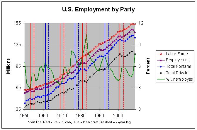


As can be seen, there was a steep jump in the unemployment rate during the first two years of every one of the four Republican periods corresponding to the recessions that began in 1953, 1970, 1981, and 2001. In addition, there was a drop in the unemployment rate during the first two years of every one of the three Democrat periods corresponding to the recoveries from the recessions that ended in 1961, 1975, and 1991. Lagging the data by two years causes all of these periods to be attributed to the other party. Hence, much of the Democrats' advantage in job growth appears to be due to recessions that occurred at the beginning of Republican presidential terms. For this reason, it makes sense to look at the job growth numbers for each party over an entire business cycle.


Looking at Job Growth Over an Entire Business Cycle


The following table attempts to look at job growth under each party over entire business cycles:


NONFARM AND HOUSEHOLD SURVEY EMPLOYMENT GROWTH BY BUSINESS CYCLE
(percent annualized over specified span of years)

Nonfarm Employment Growth Household Survey Employment Growth
--------------------------- ----------------------------------
Peak Trough Trough Peak Trough Trough
President Year to Peak to Peak to Trough to Peak to Peak to Trough
--------------- ---- -------- -------- --------- -------- -------- ---------
45-53 46-53 46-54
Truman 1945 2.3 3.3 2.7
53-60 54-60 54-61 53-60 54-60 54-61
Eisenhower 1953 1.1 1.6 1.2 0.8 1.4 1.3
60-70 61-70 61-71 60-70 61-70 61-71
Kennedy/Johnson 1961 2.7 3.2 2.8 1.9 2.0 1.8
70-74 71-74 71-75 70-74 71-74 71-75
Nixon 1969 2.3 3.3 2.2 2.4 3.2 2.1
74-81 75-81 75-83 74-81 75-81 75-83
Ford/Carter 1973 2.2 2.8 1.8 2.1 2.6 1.9
81-90 83-90 83-92 81-90 83-90 83-92
Reagan/Bush 1981 2.0 3.0 2.2 2.0 2.6 1.9
90-01 92-01 92-03 90-01 92-01 92-03
Clinton 1993 1.8 2.3 1.7 1.3 1.7 1.4
01-08 03-08 01-08 03-08
G.W. Bush 2001 0.6 1.2 0.9 1.3

As before, the sources of these numbers can be found at this link. The table shows the average annual job growth over entire business cycles for each party since 1945 for nonfarm employment and 1953 for household survey employment. It shows it both from peak to peak and from trough to trough. The peaks and troughs are those observed from Nonfarm Employment and are nearly all within 6 months of the peaks and troughs for business cycle expansions and contractions given by the National Bureau of Economic Research (NBER) at http://www.nber.org/cycles/cyclesmain.html. The exceptions are January 1992 (10 months after March 1991), January 2003 (14 months after November 2001), and August 2008 (NBER has not yet indicated a peak after March 2001). In any case, the table also shows the job growth from the trough to peak to give some measure of the maximum job growth during the business cycle.


The trough to trough values tend to better match the presidential terms and are likely the better ones to use. The one exception is G.W. Bush for which the year and values of the ending trough have not yet occurred. This is a minor issue, however, as the other trough to trough values in the table tend to be very close to the corresponding peak to peak values. One other issue, however, is that the terms of Ford and Carter are combined since they were in the same business cycle.


Looking at nonfarm employment annual growth, the table shows it to have been highest under Truman and Kennedy/Johnson at about 2.7%, a bit lower under Nixon and Reagan/Bush at 2.2%, a bit lower still under Ford/Carter and Clinton at about 1.8%, lower under Eisenhower at 1.2%, and by far the worse under G.W. Bush at 0.6%. Even the maximum job growth under G.W. Bush has been just 1.2%.


Looking at Household Survey employment growth, the table shows it to have been highest under Nixon at 2.1%, very slightly lower under Kennedy/Johnson, Ford/Carter, and Reagan/Bush at about 1.9%, a bit lower under Eisenhower and Clinton at about 1.3%, and lowest under G.W. Bush at 0.9%.


It's always possible that certain policies may have some effect on the business cycle. Still, the difference in job growth between the two parties does greatly lessen, if not disappear, if one looks at job growth over entire business cycles. The one major difference that remains is that job growth has been very poor under G.W. Bush. Hence, it appears that the contention in the aforementioned New York Times editorial that job growth under Bush is the "worst performance over a business cycle since the government started keeping track in 1945" is correct.
Sunday, September 7, 2008

Job Growth Under Bush and Prior Presidents (through August 2008)

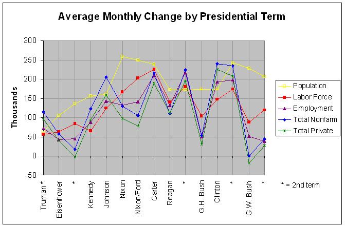
As mentioned in my prior post, the Bureau of Labor Statistics released the August employment report on September 5th. Using that data, I updated my July 13th post regarding job growth under Bush and prior presidents. Since I plan to continue updating this post, I've now placed it permanently at http://www.econdataus.com/empterm.html. Following is an updated graph of the data:


As before, the data covers the 15 presidential terms since 1949. In almost every term of a Democratic president, the growth in household survey, nonfarm, and private employment was greater than the growth in the labor force. Conversely, in almost every term of a Republican president, the growth in household survey, nonfarm, and private employment was less than the growth in the labor force. The only two exceptions in the 15 terms were Carter and Reagan's second term.


A related fact is that the unemployment rate went down during almost every term of a Democratic president and up during almost every term of a Republican president since 1949. This follows from the prior fact because the unemployment rate equals the unemployed (labor force minus the employed) divided by the labor force from the Household Survey. In any case, the only exceptions to this second fact was Carter (when the unemployment rate stayed about the same) and both terms of Reagan.


Similar results are cited in an article that appeared on September 5th in the Huffington Post. Following is an excerpt:


No Republican President -- not Eisenhower, not Nixon, not Reagan, not Bush -- has ever created more jobs, or created jobs at a faster rate, than his Democratic predecessor. It's not even close. The contrast has been especially stark over the past 16 years, when 23.1 million jobs were created under Clinton and less than 5 million were created under Bush. On average, job growth under Democrats is more than twice that under Republicans.


Of course, it is debatable exactly now much a president can effect the creation of jobs. Politicians certainly imply that they can. As the Huffington Post article points out, John McCain has stated, "As President, I will enact a Jobs for America economic plan that creates jobs." Barack Obama has likewise listed plans to promote job creation on his website. On the other hand, this New York Times article states that "Robert Barbera, chief economist at the brokerage firm of ITG/Hoenig, says that in his 30 years in the business, 'the notion that presidents create and lose jobs is the most grotesque mischaracterization of the economic backdrop' that he has witnessed". Still, even that article suggests the following in the second to the last paragraph:


If the next president wants to make the job numbers in 2012 look better, he could start thinking about all of these: education, comprehensive retraining along the model of the Army and the Job Corps and wage insurance-type incentives. Will this "create" jobs? The U.S. economy is a big liner; it isn't easily turned. But thinking in such terms will accomplish more than the never-ending tinkering with the tax code. And it is surely better than the alternatives that try to freeze the economy in place by restricting trade or supporting shrinking industries.


In any event, as long as politicians put forth programs to promote job creation and voters demand that they do so, it's worth looking at the correlation of various programs to the creation of jobs.


Note: This topic is continued in my next post.

Saturday, September 6, 2008

BLS Reports Eighth Straight Month of Job Losses

On September 5th, the Bureau of Labor Statistics released the August employment report. Following is the first paragraph of their Employment Situation Summary for August:


The unemployment rate rose from 5.7 to 6.1 percent in August, and non-farm payroll employment continued to trend down (-84,000), the Bureau of Labor Statistics of the U.S. Department of Labor reported today. In August, employment fell in manufacturing and employment services, while mining and health care continued to add jobs. Average hourly earnings rose by 7 cents, or 0.4 percent, over the month.


The 6.1 percent unemployment rate is the highest since September of 2003 and is just slightly below the prior peak of 6.3 percent reached in June of 2003. One reason why the unemployment rate increased so much last month is revealed by the next paragraph in the Summary:


Unemployment (Household Survey Data)


The number of unemployed persons rose by 592,000 to 9.4 million in August, and the unemployment rate increased by 0.4 percentage point to 6.1 percent. Over the past 12 months, the number of unemployed persons has increased by 2.2 million and the unemployment rate has risen by 1.4 percentage points, with most of the increase occurring over the past 4 months. (See table A-1.)


How is it that the number of unemployed persons rose by 592 thousand in August when there was a loss of only 84 thousand non-farm payroll jobs? One reason is because the 592 thousand figure comes from the Household Survey and the 84 thousand figure comes from the Payroll Survey. Some of the differences between these two surveys are described at this link. According to the Household Survey, employment dropped by 342 thousand in August and the labor force increased by 250 thousand. Adding these two numbers together give an additional 592 thousand people unemployed. Dividing the current unemployed (9.376 million) by the size of the labor force (154.853 million) gives 6.1 percent, the current unemployment rate.


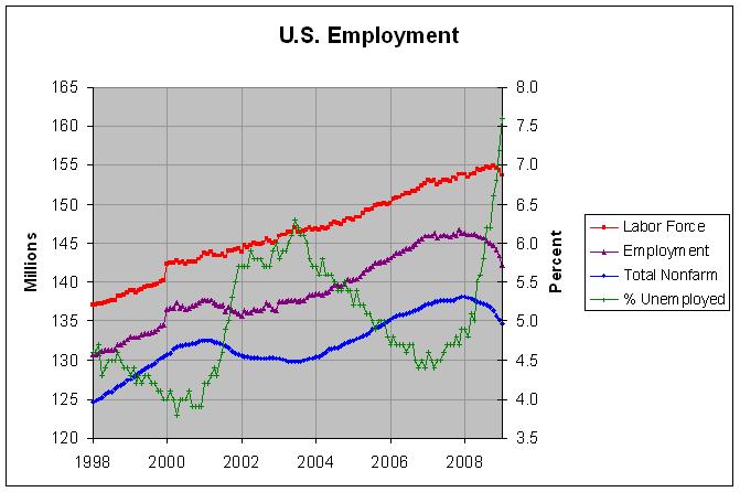
The following graph shows employment numbers from both of these surveys:


The total non-farm payroll numbers come from the Payroll Survey and the other numbers come from the Household Survey. The blue line shows that non-farm payroll has been declining since late 2007 (December was the high) but the purple line shows that employment according to the Household Survey has been fairly stagnant since late 2006. Its current level of 145.477 million is the lowest level since October of 2006. In any event, the green line shows the sharp increase in the unemployment rate over the past several months.


Job Growth Under Bush and Prior Presidents (through August 2008)


Job Growth Under Bush and Prior Presidents (continued)

About Me

I became interested in U.S. budget and economic matters back in 1992, the first time that I remember the debt becoming a major issue in a presidential election. Along with this blog, I have a website on the subject at http://www.econdataus.com/budget.html. I have blogged further about my motivations for creating this blog and website at this link. Recently, I've been working on replicating studies such as the analysis at this link.

Contact Form

Name

Email *

Message *