Monday, October 7, 2013

Is Obama Rewriting Debt-Limit History?

Is Obama Rewriting Debt-Limit History? On October 3rd, the Wall Street Journal ran an editorial titled "Kevin Hassett and Abby McCloskey: Obama Rewrites Debt-Limit History". The editorial begins as follows:

As the government shutdown continues, the nation gets closer and closer to the day—probably Oct. 17—when Washington hits the debt limit, and with it the specter of default. President Obama may be getting nervous about what will happen to his negotiating position as that day approaches.

He keeps asserting that the debt limit has never been used "to extort a president or a government party." Treasury Secretary Jack Lew is selling the same story, saying "until very recently, Congress typically raised the debt ceiling on a routine basis . . . the threat of default was not a bargaining chip in the negotiations."

The editorial goes on to say that this is "simply untrue" and describes "the shenanigans of congressional Democrats in 1989 over Medicare's catastrophic health coverage provision":

In this case, the problem was political infighting within the Democratic Party between the House and the Senate. "Weeks of political maneuvering brought the government to the brink of financial default," the New York Times wrote on Nov. 8 of that year.

The New York Times article being referred to appears to be one titled "Agreement On Raising Debt Ceiling". It begins:

After weeks of political maneuvering that brought the Government to the brink of financial default, Congress tonight approved legislation raising the national debt limit to $3.12 trillion through Sept. 30, 1990.

The article does state that the bill "also paves the way for Congressional approval of separate legislation modifying the Medicare insurance program that covers the catastrophic costs of major illness", the issue mentioned by the Journal editorial. However, it goes on to describe the final holdup to the bill's passage:

At one point, the Senate majority leader, George J. Mitchell of Maine, stormed off the floor, saying he was going to telephone President Bush and Treasury Secretary Nicholas F. Brady and inform them that the bill could not be passed because a single Republican senator, John Heinz of Pennsylvania, had refused to give his consent to proceed.

Leaders in the House and Senate had agreed earlier in the day to approve the bill with only one amendment - a measure repealing 1986 tax rules that bar discrimination in employer-paid health insurance plans. Link to Social Security

But as Mr. Mitchell rose to explain that agreement and move toward a vote, Mr. Heinz objected, saying he would not allow the vote unless the Senate also agreed to consider an amendment to remove the Social Security trust fund surplus from calculation of the Federal deficit.

The article then describes the resolution to this holdup and concludes as follows:

Congressional delays in approving debt limit measures have become routine over the last decade as lawmakers scramble to attach pet initiatives to what they know is must-pass legislation. But the situation this year was particularly complicated because the debt limit bill became entangled in the fierce battles over budget legislation and efforts to cut the capital gains tax.

Republicans agreed last week to abandon their attempts to attach a capital gains tax cut to the debt limit bill, a measure they had regarded as their best hope for winning the votes needed to pass a tax cut this year.

Hence, a Republican Senator played a key role in the final holdup and Republicans had attempted to attach a capital gains tax cut to the bill. For some reason, the editorial did not see fit to report anything except the "shenanigans of congressional Democrats".

In any case, the Journal editorial goes on to state:

One thing is certain: The debt limit has been a powerful negotiating tool in the last several decades. It has enabled the passage of important additional legislation.

According to the Congressional Research Service, Congress voted 53 times from 1978 to 2013 to change the debt ceiling. The debt ceiling has increased to about $16 trillion from $752 billion.

Further on, the editorial states:

Congressional Republicans who want legislative conditions in exchange for a debt-limit increase are following a strategy that has been pursued by both parties the majority of the time. Of the 53 increases in the debt limit, 26 were "clean"—that is, stand-alone, no strings-attached statutes. The remaining debt-limit increases were part of an omnibus package of other legislative bills or a continuing resolution. Other times, the limit was paired with reforms, only some of which were related to the budget.

This statistic has been mentioned recently by a number of people. On the October 6th "This Week With George Stephanopoulos", Paul Gigot, editor of the editorial pages for The Wall Street Journal, stated:

"There have been 53 debt limit increases since 1978, and 27 of those were not clean. They were not just raise the debt limit. They included reforms. Often important, budget reforms."

Following is a longer discussion of the statistic from "Fox News Sunday" on the same day:

OBAMA: You have never seen in the history of the United States the debt ceiling or the threat of not raising the debt ceiling being used to extort a president or a governing party and trying to force issues that have nothing to do with the budget and have nothing to do with the debt.

(END VIDEO CLIP)

WALLACE: But, Mr. Secretary, that is just not true. Congress has voted to raise the debt ceiling 53 times since 1978. More than half -- 27 times -- it's been linked to something else. And among those items it's been linked to: campaign finance reform, school prayer and busing and a nuclear freeze.

What's unprecedented is not Congress tying strings. What's unprecedented is the president refusing to negotiate.

LEW: You know, Chris, let me be clear. The president has always been looking for a way to negotiate, find that reasonable middle ground with a bipartisan, you know, group of members and senators to do the right thing for the American people. He was -- he has -- he put out a budget that actually took an enormous step to do that.

So the president is open to negotiation. The question about the debt limit is different.

And, frankly, I think your history is wrong. If you look at the cases where the debt limit was involved, there were many other things attached to the debt limit, but the question of threatening to cause a default of the United States, not until 2011 did it become a positive agenda.

WALLACE: Mr. Secretary, your history -- with all due respect, your history is wrong.

So let's look at the Congressional Research Service study from which this statistic comes. It appears to have come from a study titled "Votes on Measures to Adjust the Statutory Debt Limit, 1978 to Present, released February 15, 2013. In its Summary, the study does state the following:

Since 1978, the statutory federal debt limit has been changed 53 times by Congress through the enactment of legislation adjusting the federal debt limit, either as stand-alone legislation or as part of legislation dealing with other matters.

The study contains three tables. Table 1 lists information on all 53 debt limit measures since 1978. Table 2 identifies 26 stand-alone measures from these 53. Table 3 then lists the other 27 bills considered as other than stand-alone measures and provides brief background information on the nature of each measure and by what means it was considered. The following table gives some of the key items from Table 1 for the 27 non-stand-alone measures:

               OTHER THAN STAND-ALONE DEBT LIMIT MEASURES

                       House Vote       Senate Vote     Public Law    Debt
                    ----------------  ----------------     Date of   Limit
Year  Bill Number   Tally     Margin  Tally     Margin   Enactment ($ bil)
----  ------------  --------  ------  --------  ------  ----------  ------
1979  H.R. 2534     209-165       44  62-33         29    4/2/1979     830*
      H.R. 5369     219-198       21  49-29         20   9/29/1979     879*
1980  H.R. 7428     335-34       301  68-10         58    6/6/1980    n.c.
1983  H.R. 2990     Voice Vote        51-41         10   5/26/1983    1389*
1984  H.R. 5692     211-198       13  Voice Vote         5/25/1984    1520*
1985  H.R. 3721     300-121      179  Voice Vote        11/14/1985  1903.8
      H.J.Res. 372  271-154      117  61-31         30  12/12/1985  2078.7
1986  H.R. 5300     305-70       235  61-25         36  10/21/1986    2300
1987  H.J.Res. 324  230-176       54  64-34         30   9/29/1987    2800*
1989  H.R. 3024     231-185       46  Voice Vote          8/7/1989    2870*
      H.J.Res. 280  269-99       170  Voice Vote         11/8/1989  3122.7
1990  H.J.Res. 666  362-3        359  Voice Vote         10/9/1990    n.c.
      H.J.Res. 677  379-37       342  Voice Vote        10/19/1990    n.c.
      H.J.Res. 681  380-45       335  Unanimous Consent 10/25/1990    n.c.
      H.J.Res. 687  283-49       234  Voice Vote        10/28/1990    3230
      H.R. 5835     228-200       28  54-45          9   11/5/1990    4145*
1993  H.R. 2264     218-216        2  51-50          1   8/10/1993    4900*
1996  H.R. 2924     396-0        396  Unanimous Consent   2/8/1996
      H.R. 3021     362-51       311  Voice Vote         3/12/1996
      H.R. 3136     328-91       237  Unanimous Consent  3/29/1996    5500
1997  H.R. 2015     346-85       261  85-15         70    8/5/1997    5950
2008  H.R. 3221     272-152      120  72-13         59   7/30/2008   10615
      H.R. 1424     263-171       92  74-25         49   10/3/2008   11315*
2009  H.R. 1        246-183-1     63  60-38         22   2/17/2009   12104*
2010  H.J.Res. 45   233-187       46  60-39         21   2/12/2010   14294*
2011  S. 365        269-161      108  74-26         48    8/2/2011   16394
2013  H.R. 325      285-144      141  64-34         30    2/4/2013

* measures with a final vote margin of less than 100 in the House or less
  than 30 in the Senate
Note: n.c. = no change
Source: "Votes on Measures to Adjust the Statutory Debt Limit, 1978 to Present
A number of interesting facts are evident from this table. First of all, it doesn't appear that all of these 27 cases are independent. For example, there are 5 cases in less than a month, from 10/9/1990 through 11/5/1990. The first 3 of these cases involve no raise in the debt limit. Perhaps more interesting, the majority of these votes do not appear to be heavily contentious. Only 11 of the 27 measures resulted in a final vote margin of less than 100 in the House or less than 30 in the Senate.

The following table contains notes from Table 3 on the 27 non-stand-alone measures:

               OTHER THAN STAND-ALONE DEBT LIMIT MEASURES

Year  Notes on the Measure
----  --------------------
1979  required Congress & President present balanced budgets for 81 and 82
      made increase in debt limit part of budget process (in the House)
1980  included a repeal of the Presidentially imposed oil import fee
1983  included making the whole debt limit permanent
1984  included some miscellaneous admin authority to Treasury Secretary
1985  extended for a month some expiring acts, including a cigarette tax
      required report on legislation for alternative minimum corporate tax
1986  required the restoration of lost interest to certain trust funds
1987  used as legislative vehicle for the Balanced Budget ... Act of 1987
1989  included change in method of accounting for federal debt instruments
      repealed nondiscrimination rules that deal w/ employee benefit plans
1990  change in Debt Limit included in a continuing appropriations measure
      change in Debt Limit included in a continuing resolution
      change in Debt Limit included in a continuing resolution
      change in Debt Limit included in a continuing resolution
      change in Debt Limit included in Omnibus Budget Recon. Act of 1990
1993  change in Debt Limit included in Omnibus Budget Recon. Act of 1993
1996  temporarily exempted from limit monthly insurance benefits to SSA
      temporarily exempted from limit monthly insurance benefits to SSA
      included an increase in the debt limit in Title III
1997  included a debt limit increase in Title V, Subtitle G
2008  included an increase to the debt limit
      included an increase to the debt limit
2009  included an increase to the debt limit
2010  included provisions for “Statutory PAYGO” and “wasteful spending”
2011  included provisions aimed at deficit reduction
2013  required hold on Member salary if no budget resolution by April 15

Source: "Votes on Measures to Adjust the Statutory Debt Limit, 1978 to Present
These are of course very abbreviated notes on the measures. Still, they suggest that most of the additional items in the measure were not very major. I saw no mention of the issues that Wallace mentioned above (campaign finance reform, school prayer and busing and a nuclear freeze). Also, it appears that some of the debt limit increases may have been included with other bills (such as continuing resolutions) simply for convenience. At the very least, more study would be required for these cases. Simply treating all non-stand-alone measures the same does not make sense. Hence, it may be correct that, as Secretary Lew suggested above, "the question of threatening to cause a default of the United States, not until 2011 did it become a positive agenda".

On Friday, Warren Buffett was quoted as saying the following about the debt ceiling:

It ought to be banned as a weapon. It should be like nuclear bombs, I mean, basically too horrible to use.”

In fact, according to this article, only one democratic country, besides America, has a debt ceiling. That country is Denmark but the article states that they "set the ceiling high enough so that it never slows the process of borrowing money and they can avoid political conflicts like the one currently gripping the U.S.". The article continues:

Barry Bosworth, a senior fellow at the Brookings Institute, said the U.S. debt ceiling “has no logical basis.”

Congress, through budget and appropriations bills, has sole authority to decide how much the government will spend, so he said “it makes no sense to have a secondary rule to then object to the deficit that emerges from the other decisions.”

At the very least, we could legislate that the debt ceiling must always be addressed in a stand-alone measure. Meanwhile, those who distort history to defend such threats, as do the authors of the Journal editorial, should be challenged.

Note: On a related issue, this article explains why government shutdowns only seem to occur in America.

Saturday, May 4, 2013

Is There a Debt/GDP Threshold at 90 Percent? (Part 2)

Is There a Debt/GDP Threshold at 90 Percent? (Part 2)

As mentioned in my prior post, I have posted an Excel spreadsheet which is an extension of one included in a zip file posted by Herndon, Ash and Pollin (hereafter called HAP). I will use data from that spreadsheet to look at the HAP criticisms of the Reinhart and Rogoff (hereafter called RR) paper described previously.

A good starting point is the now infamous Excel spreadsheet shown in my prior post and repeated below:

Rogoff and Rinehart Excel error

After noting the coding error by which 5 rows were excluded, the first question that occurred to me was "where's the beef?". The number of countries on which the 90 percent threshold is based is a mere seven (Belgium having been left out by RR). The HAP critique points out that RR is using only 71 data points (110 after Belgium and 14 other excluded data points are added). Since there were relatively few data points, my first inclination was to try to look at that data so see how it was distributed. The following table shows the 71 data points used by RR, the 25 data points for Belgium, and the other 14 excluded data points (marked by ^):

        REAL GDP GROWTH FOR DEBT OF 90 PERCENT OF GDP OR ABOVE FOR 1946-2009

                                            New                    Aus-
Belgium* Greece   Italy Ireland   Japan Zealand      UK      US  tralia* Canada* Year
------- ------- ------- ------- ------- ------- ------- ------- ------- ------- -----
                                            7.7^   -2.5   -10.9    -3.6^   -1.0^ 1946
   15.2                                    11.9^   -1.3    -0.9     2.5^    4.4^ 1947
                                           -9.9^    2.9     4.4     6.4^    1.8^ 1948
                                           10.8^    3.3    -0.5     6.6^    2.2^ 1949
                                                    3.2             6.9^    7.4^ 1950
                                           -7.6     2.7                          1951
                                                    0.1                          1952
                                                    3.8                          1953
                                                    4.1                          1954
                                                    3.5                          1955
                                                    0.9                          1956
                                                    1.7                          1957
                                                    0.3                          1958
                                                    4.3                          1959
                                                    5.3                          1960
                                                    2.3                          1961
                                                    1.1                          1962
                                                    4.3                          1963
                                                    5.5                          1964
                                                                                 1965
-------------------------(no cases from 1965 to 1982)--------------------------------
                                                                                 1982
                           -0.7                                                  1983
    2.1                     3.2                                                  1984
    1.8                     1.9                                                  1985
    1.9                     0.4                                                  1986
    2.4                     3.6                                                  1987
    4.6                     3.0                                                  1988
    3.6                     5.6                                                  1989
    3.1                                                                          1990
    1.8     3.1                                                                  1991
    1.3     0.7                                                                  1992
   -0.7    -1.6    -0.9                                                          1993
    3.3     2.0     2.2                                                          1994
    4.3     2.1     2.8                                                          1995
    0.9     2.4     1.1                                                          1996
    3.7     3.6     1.9                                                          1997
    1.7     3.4     1.4                                                          1998
    3.4     3.4     1.5            -0.1                                          1999
    3.8     4.5     3.7             2.9                                          2000
    0.8     4.2     1.8             0.2                                          2001
    1.5     3.4                     0.3                                          2002
    1.0     5.6                     1.4                                          2003
    2.8     4.9                     2.7                                          2004
    2.2     2.9                     1.9                                          2005
            4.5                     2.0                                          2006
            4.0                     2.3                                          2007
    1.0     2.9                    -0.7                                          2008
   -3.2    -0.8    -5.1            -5.4                                          2009

* column excluded by RR because of Excel error
^ data excluded by RR
Note that the 1951 data point for New Zealand is the only data point used by RR for that country. The data points from 1946 to 1949 for New Zealand are excluded. Tab A of the aforementioned spreadsheet shows the following numbers for New Zealand from 1946 to 1955:
           DEBT/GDP AND REAL GDP GROWTH FOR NEW ZEALAND: 1946-1955

Year                1946  1947  1948  1949  1950  1951  1952  1953  1954  1955
------------------ ----- ----- ----- ----- ----- ----- ----- ----- ----- -----
Debt/GDP(%)        134.0 120.4 117.2 111.5  87.7  91.8  85.8  79.3  75.3  73.8
Real GDP Growth(%)   7.7^ 11.9^ -9.9^ 10.8^ 14.7  -7.6   4.3   3.4  13.8   1.9

^ data excluded by RR
As can be seen, New Zealand had real GDP growth of 14.7% the year before and 4.3% the year after the -7.6% growth in 1951. Hence, if RR had used a debt threshold of 85% of GDP, the average rate of growth would have been 3.8 percent. On the other hand, if RR had used a debt threshold of 95% of GDP, New Zealand would have had no data points. Both of these calculations assume that RR continues to exclude 1946 through 1949. If these are included, the averages become 4.6 and 5.1 percent, respectively. Only by using a threshold of 90% of GDP and excluding 1946 through 1949 did RR come up with -7.6 percent. A cursory inspection of the data, as I have done here, would have shown the -7.6 figure to be an unrepresentative outlier, requiring some sort of corrective action.

That cursory inspection also turns up the real GDP growth of -10.9% for the U.S. in 1946. This was the year after World War II ended so it's no surprise that real GDP dropped that year. If that year had been excluded, the average real GDP growth for years that the U.S. was above the 90% threshold would have been +1.0 percent instead of -2.0 percent.

One might argue that Belgium's real GDP growth of 15.2% in 1947 was also an outlier. Excluding that year, however, just drops the average real GDP growth for years that Belgium was above the 90% threshold from 2.6% to 2.0%. This is because the effect of an outlier is much greater in a small country sample when the weighting is done per country as was done by RR.

The following table shows the effect on the average real GDP growth for all years above the 90% threshold of various corrections and changes in calculation method:

 AVERAGE REAL GDP GROWTH FOR DEBT OF 90 PERCENT OF GDP OR ABOVE FOR VARIOUS SCENARIOS

                                            New                    Aus-
Belgium* Greece   Italy Ireland   Japan Zealand      UK      US  tralia* Canada*  TOTAL  Scenario
------- ------- ------- ------- ------- ------- ------- ------- ------- ------- -------  --------
            2.9     1.0     2.4     0.7    -7.6     2.4    -2.0                   -0.02  RR (Reinhart and Rogoff)
    2.6     2.9     1.0     2.4     0.7    -7.6     2.4    -2.0                     0.3  + fix Excel Error
    2.6     2.9     1.0     2.4     0.7     2.6     2.4    -2.0                     1.6  + include 1946-1950 for New Zealand
    2.6     2.9     1.0     2.4     0.7     2.6     2.4    -2.0     3.8     3.0     1.9  + include 1946-1950 for Australia & Canada

   64.2    55.3    10.3    17.1     7.6    12.9    45.6    -8.0    18.9    14.8   238.6  Total of all country-years
   25.0    19.0    10.0     7.0    11.0     5.0    19.0     4.0     5.0     5.0   110.0  Count of country-years
------- ------- ------- ------- ------- ------- ------- ------- ------- ------- -------  ----------------------
    2.6     2.9     1.0     2.4     0.7     2.6     2.4    -2.0     3.8     3.0     2.2  Country-year weighting, all data

            2.9     1.0     2.4     0.7             2.4    -2.0                     1.2  RR minus New Zealand
            2.9     1.0     2.4     0.7             2.4     1.0                     1.7  RR minus New Zealand and 1946 for U.S.
    2.6     2.9     1.0     2.4     0.7             2.4                             2.0  RR minus countries with no cases after 1951
    2.0     2.9     1.0     2.4     0.7             2.9                             2.0  RR for 1952-2009 instead of 1946-2009
    2.0     2.9     1.0     2.4     0.7                                             1.8  RR for 1980-2009 instead of 1946-2009

* column excluded by RR because of Excel error
^ data excluded by RR
The first line shows the slightly negative figure calculated by RR (Reinhart and Rogoff). The next 4 results are in response to various corrections suggested by HAP. The second line shows an improvement of 0.3% when the infamous Excel error is fixed. The biggest improvement of 1.3% occurs in the third line when the missing years of 1946 to 1949 are included for New Zealand. Another improvement of 0.3% occurs when the missing years of 1946 to 1950 are included for Australia and Canada. Finally, another improvement of 0.3% occurs if the data is weighted by country-year instead of by country as suggested by HAP. This gives a real GDP growth of 2.2 percent given by HAP in the Abstract on page 1 of their critique.

The final 5 lines show that, even if one insists on weighing the data by country instead of country-year, any reasonable attempt to minimize the effect of outliers will bring the result much closer to HAP's value of 2.2% than RR's value of -0.02%. The first of these shows that simply excluding the outlier of New Zealand will cause an improvement of 1.2 percent. The second shows that another improvement of 0.5% occurs if one excludes the outlier of the U.S. in 1946.

A more consistent way of dealing with the small samples of debt right after World War II would be to exclude all countries with no case after 1951. This would raise the real GDP growth to 2.0 percent, nearly as high as the HAP value of 2.2 percent. The same result would occur if the starting year of the data was moved from 1946 up to 1952. The final line shows that, if the study were to simply focus on the "modern era" after 1980, the result would be a nearly-as-high 1.8 percent. As can be seen, any of the fixes beyond merely fixing the Excel error would bring the calculation much closer to HAP's value of 2.2 percent than RR's value of -0.02 percent.

What is the lesson to be learned from all of this?

As mentioned here and here, the Reinhart and Rogoff paper was not peer-reviewed. However, the latter article makes the following interesting comment:

So the answer is to only accept peer-reviewed work as economic knowledge, right? Nope. That would be a) too limiting, and b) wouldn't advance the epistemological cause as much as you think. Peers have their own sets of biases, particularly as gate keepers.

I do think that peer-review does have a role to play but I can see that it's not the only answer. However, it does seem that we could at least clearly label what is peer-reviewed and what is not. I don't recall the absence of peer-review having been mentioned once during the public debate of the past three years. Only once the Excel error was found did we hear, "Oh yeah, that paper was never peer-reviewed".

There is an additional step that I think would help a great deal. For any paper to be taken seriously, the authors should have to give their sources AND show their work. In their online appendix, RR stated:

We took great pains to provide the data in as accessible form as possible, including especially meticulous source documentation in the spreadsheets, far more than one sees normally posted with journal papers. So we are simply stunned when bloggers and irresponsible commentators say we have not shared our debt data. Open access to our data has been central to our whole project.

I believe that RR is referring to the links to data that they have posted here. However, it seemed that HAP had to go through a great deal of effort to recreate RR's numbers. It was only by requesting the original Excel spreadsheet that they were able to start recreating the numbers. Speaking of the spreadsheet, I was unable to find a copy of the spreadsheet anywhere on the web even now. I manually typed in the numbers that appeared in the one graphics that I saw on the web and added it as tab C in my spreadsheet. I then tried to reproduce the numbers in the spreadsheet using RR's sources but was unable to find all of the data. Fortunately, HAP posted the zip file with their spreadsheet and I was able to replicate the numbers with that.

Why don't economists just post their original spreadsheets? There may be many reasons. Some may be willing to put up with peer-review when required but not want every pointy-headed number-cruncher with too much time on their hands to be going through their work. I suspect that those number-crunchers would catch a number of errors or questionable methodology that peer-review would not catch. In addition, some economists might feel that publishing their spreadsheets would reveal trade secrets and/or help other economists to compete in their area of study. Hence, I think that it's largely up to those who consume the studies to demand that the work be released. Of course, economists would still be free to release studies without peer-review and showing precisely how they arrived at their conclusions. But if those studies were simply ignored or treated as interesting ideas until they can be verified, I suspect that many of those economists would be willing to "show their work".

Note: There is a discussion of this post at this link.

Is There a Debt/GDP Threshold at 90 Percent? (Part 1)

In January of 2010, Harvard economists Carmen M. Reinhart and Kenneth S. Rogoff released an NBER working paper titled "Growth in a Time of Debt". The paper's abstract states:

Our analysis is based on new data on forty-four countries spanning about two hundred years. The dataset incorporates over 3,700 annual observations covering a wide range of political systems, institutions, exchange rate arrangements, and historic circumstances. Our main findings are: First, the relationship between government debt and real GDP growth is weak for debt/GDP ratios below a threshold of 90 percent of GDP. Above 90 percent, median growth rates fall by one percent, and average growth falls considerably more.

This 90 percent threshold was cited by a number of public figures. For example, Paul Ryan stated the following on page 80 of the House Fiscal Year 2013 Budget Resolution titled "The Path to Prosperity: A Blueprint for American Renewal".

Even if high debt did not cause a crisis, the nation would be in for a long and grinding period of economic decline. A well-known study completed by economists Ken Rogoff and Carmen Reinhart confirms this common-sense conclusion. The study found conclusive empirical evidence that gross debt (meaning all debt that a government owes, including debt held in government trust funds) exceeding 90 percent of the economy has a significant negative effect on economic growth.

As another example, a Washington Post editorial stated the following:

The CBPP analysis assumes steady economic growth and no war. If that’s even slightly off, debt-to-GDP could keep rising — and stick dangerously near the 90 percent mark that economists regard as a threat to sustainable economic growth.

A number of other positive references to the 90 percent threshold are mentioned in this article. However, there were some criticisms of this 90 percent threshold as in this article from the Economic Policy Institute.

In any case, a very interesting thing happened in April of 2013, over three years after the Reinhart and Rogoff paper was released. The event is described in Planet Money podcast titled "Episode 452: How Much Should We Trust Economics?". The following is from a summary of the show:

Reinhart and Rogoff looked at what had happened in many different countries over many years. And they found a what looked like a clear debt threshold: 90 percent. Average growth was much, much slower in countries with debt-to-gdp ratios over 90 percent.

The paper got a lot of coverage in the press. Politicians cited it in the U.S. and Europe.

Then, this week, a 28-year-old grad student and his professors published a startling finding: Reinhart and Rogoff [hereafter called RR] had made a simple Excel error in one part of their study. The authors of the new critique also questioned other elements of the study and argued that, in fact, there is no debt threshold.

The new critique was published by Herndon, Ash and Pollin (hereafter called HAP) and is titled "Does High Public Debt Consistently Stifle Economic Growth? A Critique of Reinhart and Rogoff". The error that was most widely reported was the simple Excel error, shown in the following image:

Rogoff and Rinehart Excel error

As seen, the formula for cell L51 is given as AVERAGE(L30:L44), the cells within the blue box. In fact, the formula should have been AVERAGE(L30:L49). This mistake served to omit the data for Denmark, Canada, Belgium, Austria, and Australia. In the case of column L, only the Belgium omission mattered since the other four omitted countries did not have data for that column. However, the same mistake was made in columns I, J, and K which did contain data for those other four countries.

However, the HAP critique pointed out two other issues. One was data exclusion which it described as follows:

More significant are RR's data exclusions with three other countries: Australia (1946-1950), New Zealand (1946-1949), and Canada (1946-1950). The exclusions for New Zealand are of particular significance. This is because all four of the excluded years were in the highest, 90 percent and above, public debt/GDP category. Real GDP growth rates in those years were 7.7, 11.9, -9.9, and 10.8 percent. After the exclusion of these years, New Zealand contributes only one year to the highest public debt/GDP category, 1951, with a real GDP growth rate of -7.6 percent. The exclusion of the missing years is alone responsible for a reduction of -0.3 percentage points of estimated real GDP growth in the highest public debt/GDP category. Further, RR's unconventional weighting method that we describe below amplifies the effect of the exclusion of years for New Zealand so that it has a very large effect on the RR results.

The other was the unconventional weighting method mentioned at the end of the above excerpt. As an example, Great Britain had 19 postwar years (1946 to 1964) when it's debt to GDP was above 90 percent and the average growth in real GDP over this period was 2.4 percent. According to RR, however, New Zealand had just one year above 90 percent (1951) and the growth in real GDP for that year was -7.6 percent. RR give the -7.6 percent the same weight as Great Britain's 2.4 percent despite the fact that the former is for one year and the latter is for 19 years. HAP, on the other hand, gives the latter 19 times as much weight as the former.

In an April 25th New York Times editorial, RR responded to these criticisms, saying the following:

Last week, three economists at the University of Massachusetts, Amherst, released a paper criticizing our findings. They correctly identified a spreadsheet coding error that led us to miscalculate the growth rates of highly indebted countries since World War II. But they also accused us of “serious errors” stemming from “selective exclusion” of relevant data and “unconventional weighting” of statistics — charges that we vehemently dispute. (In an online-only appendix accompanying this essay, we explain the methodological and technical issues that are in dispute.)

In an April 29th New York Times editorial, Pollin and Ash responded, saying:

(Ms. Reinhart and Mr. Rogoff have substantial disagreements with us about the proper selection and weighting of data. They elaborated on these points in their Op-Ed appendix. We have presented all our data, calculations and methodological arguments on the Web site of the Political Economy Research Institute at the University of Massachusetts, Amherst, where we teach.)

The given Web site points to a page for the HAP critique which points to a zip file containing "Data and code files upon which the results are based". This zip file contains an Excel spreadsheet named RR.xls which contains all of the data on which the HAP critique is based, including the original RR data. I added three tabs labeled A, B, and C to the beginning of this spreadsheet on which I used this data to examine the HAP criticisms. I have posted that spreadsheet at http://www.econdataus.com/RR2.xls and will refer to it in the following post.

Is There a Debt/GDP Threshold at 90 Percent? (Part 2)

Monday, March 25, 2013

Do Tax Cuts Increase Revenue? (Part 2)

On March 24th, a reader posted a long comment following my post of November 8, 2010 titled "Do Tax Cuts Increase Revenue?". It covered a lot of ground so it seemed that it would be useful to answer it in a post. Following is the reader's comment, interspersed with my replies:

Hello my name is Marshall and i have some issues with your blog "EFFECT OF REAGAN, KENNEDY, AND BUSH TAX CUTS ON REVENUES" I found some issues here mainly involving the Reagan Tax cuts.

you say and i quote

"the GDP reached a high 10-year growth rate of 35.2% from 1983 to 1993. However, it reached higher highs of 37.5 from 1992 to 2002, 45.71% from 1947 to 1957, and 50.28% from 1958 to 1968. In fact, the above graph shows that the 10-year growth rate in the GDP has been relatively stable since 1975 to 1985 though it began to drop in 2008 and is projected to stay weak through 2015. Hence, these figures don't provide any strong evidence that the Reagan tax cuts permanently affected the GDP one way or the other."

As the reader states, his comment actually involves my analysis titled EFFECT OF REAGAN, KENNEDY, AND BUSH TAX CUTS ON REVENUES. The above quote is from the end of the section titled "EFFECT OF REAGAN TAX CUTS ON REVENUES AND GDP - LONG ANALYSIS". To give it more context, following is the full paragraph:

Hence, the evidence is that the Reagan tax cuts DECREASED revenues over what they would have been, at least over the short (10-year) term. The only remaining argument in favor of the Reagan tax cuts, at least from a revenue point of view, would seem to be that they permanently raised the level of the GDP, thus bringing in slightly higher revenues far into the future. According to the graph and second table, the GDP reached a high 10-year growth rate of 35.2% from 1983 to 1993. However, it reached higher highs of 37.5 from 1992 to 2002, 45.71% from 1947 to 1957, and 50.28% from 1958 to 1968. In fact, the above graph shows that the 10-year growth rate in the GDP has been relatively stable since 1975 to 1985 though it began to drop in 2008 and is projected to stay weak through 2015. Hence, these figures don't provide any strong evidence that the Reagan tax cuts permanently affected the GDP one way or the other.

The reader continues:

now there are some issues with this:

yes GDP growth was very consistent from the 40's to the 70's (though there was a slight decline in the 70's)and the 80's (January 1980-December 1990) from what it seems didn't change the GDP rating all that much compared to any of these decades. However it's worth noting that the GDP growth of the 90's was no where in comparison really (January 1990-December 2000. When looking at the mean/avg the 80's number seems to be in the ballpark of about 4.6, 4.7 GDP, however for the 90's it seems to be about 3.8, 3.9 somewhere in between these numbers so overall looking at that it does seem that Reagan's tax cuts may not have had any real impact but Clinton's tax increases (along with Bush 41's increases) didn't seem to be all that beneficial to GDP growth. My overall point being that tax cuts may not be that bad especially when compared to tax increases.

here's the website displaying GDP growth rate it's interactive as well:
http://www.tradingeconomics.com/united-states/gdp-growth

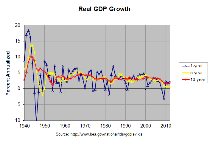
Can you provide your source for the above GDP growth numbers? They do not agree with the numbers that I have seen. The following graph is from my last blog post titled "Do Tax Cuts Increase Economic Growth?":

The blue, yellow, and red lines show the 1-year, 5-year, and 10-year annualized changes in the quarterly real GDP. The graph shows that the 10-year annualized change was relatively stable from 1974 to 2008, remaining between 2 and 4 percent for that entire period. Much of that apparent stability was due to the fact that 10 years just happens to be close to the length of several of the past business cycles. Recall that the three recessions prior to 2008 were in 2001, 1990-91, and 1980-82. That pattern was broken by the deep recession of 2008-09.

The above graph does not show GDP growth to have been noticeably better during the 80's than the 90's. To get a more accurate measurement, it is better to look at GDP growth over entire business cycles. The following table shows real GDP growth over all business cycles (taken from trough to trough) since 1949 as determined by the National Bureau of Economic Research:

                            REAL GDP GROWTH BY BUSINESS CYCLE

                GDP       GDP    Last Quarter          Entire Cycle
           (billion  (billion  ---------------- --------------------------
            current   chained  Percent  Annual-     # of  Percent  Annual-  Prior
Year  Qtr  dollars)   2005 $)   Change     ized Quarters   Change     ized  Trough   Trough
----  ---  --------  --------  -------  -------  -------  -------  -------  ------  -------
1949    4     265.2    1838.7     -0.9     -3.7
1954    2     376.0    2306.4      0.1      0.5       18     25.4     5.17  1949q4   1954q2
1958    2     458.0    2534.5      0.6      2.5       16      9.9     2.39  1954q2   1958q2
1961    1     528.0    2816.9      0.6      2.4       11     11.1     3.92  1958q2   1961q1
1970    4    1052.7    4253.0     -1.1     -4.2       39     51.0     4.32  1961q1   1970q4
1975    1    1569.4    4791.2     -1.2     -4.8       17     12.7     2.84  1970q4   1975q1
1980    3    2785.2    5771.7     -0.2     -0.7       22     20.5     3.44  1975q1   1980q3
1982    4    3312.5    5866.0      0.1      0.3        9      1.6     0.72  1980q3   1982q4
1991    1    5880.2    7943.4     -0.5     -1.9       33     35.4     3.74  1982q4   1991q1
2001    4   10373.1   11370.0      0.3      1.4       43     43.1     3.39  1991q1   2001q4
2009    2   13885.4   12701.0     -0.1     -0.3       30     11.7     1.49  2001q4   2009q2
2012    4   15829.0   13647.6      0.0     -0.1       14      7.5     2.08  2009q2   2012q4*

* 2012, quarter 4 has not been identified as a trough. It is just the most recent quarter.
Some of the business cycles are arguably too short to provide meaningful data. The following table combines the shorter business cycles to remedy this:
                REAL GDP GROWTH BY BUSINESS CYCLE (shorter cycles combined)

                GDP       GDP    Last Quarter          Entire Cycle
           (billion  (billion  ---------------- --------------------------
            current   chained  Percent  Annual-     # of  Percent  Annual-  Prior
Year  Qtr  dollars)   2005 $)   Change     ized Quarters   Change     ized  Trough   Trough
----  ---  --------  --------  -------  -------  -------  -------  -------  ------  -------
1949    4     265.2    1838.7     -0.9     -3.7
1961    1     528.0    2816.9      0.6      2.4       45     53.2     3.86  1949q4   1961q1
1970    4    1052.7    4253.0     -1.1     -4.2       39     51.0     4.32  1961q1   1970q4
1980    3    2785.2    5771.7     -0.2     -0.7       39     35.7     3.18  1970q4   1980q3
1991    1    5880.2    7943.4     -0.5     -1.9       42     37.6     3.09  1980q3   1991q1
2001    4   10373.1   11370.0      0.3      1.4       43     43.1     3.39  1991q1   2001q4
2009    2   13885.4   12701.0     -0.1     -0.3       30     11.7     1.49  2001q4   2009q2
2012    4   15829.0   13647.6      0.0     -0.1       14      7.5     2.08  2009q2   2012q4*

* 2012, quarter 4 has not been identified as a trough. It is just the most recent quarter.
As you can see in the table above, the 2 business cycles from 1980 to 1991 had an annualized GDP growth rate of 3.09 percent versus a slightly higher 3.39 percent during the business cycle from 1991 to 2001. The first table shows that the annualized GDP growth rate of the single business cycle from 1982 to 1991 was a slightly higher 3.74 percent. In any case, all of these growth rates are about the same and no where close to the 4.6 or 4.7 percent growth rate that you quote for the 80's above. Where did those numbers come from?

The reader continues:

now you also asked for examples of tax cuts being beneficial I have some links to provide but I'd like to say two things before hand

Actually, I said the following in my analysis:

There may well be valid arguments in favor of tax cuts. But higher tax revenues does not appear to be one of them.

Then in the blog post to which you replied, I concluded with the following:

As I mentioned, I am yet to find a single economic study that purports to show evidence that any income tax cut has ever paid for itself. If anyone who reads this should know of one, please leave a comment with a link to that study. Thanks.

In any case, the reader continues:

1. these links are obviously in favor of lower taxes they are the Heritage Foundation, a obviously Conservative site and also I believe it's called the Freedom and Prosperity Institute or so

2. I'm not sure if you've read them or not but they are worth looking in to also one of them is a video series which should be even easier though the video doesn't give any direct links it does refer to the IRS "SOI" which is something

that being said here are the links:

Heritage:

http://www.heritage.org/research/reports/2001/05/lowering-marginal-tax-rates,
http://www.policyarchive.org/handle/10207/bitstreams/8333.pdf

Both of those articles are written by Daniel J. Mitchell. In fact, I wrote a blog post that referenced the second article titled How to Mislead with Statistics. Following is an excerpt:

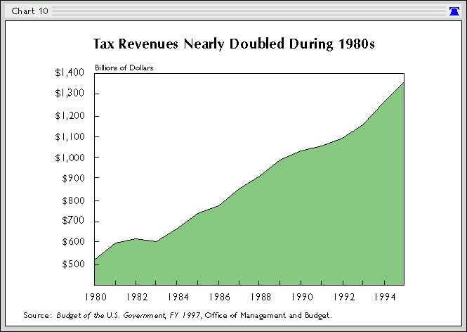
I first became familiar with Dr. Mitchell writings when he worked for the Heritage Foundation. The first one that I remember seeing was titled The Historical Lessons of Lower Tax Rates. Following is a chart from that article:

Dr. Daniel Mitchell Chart 10

The numbers in this chart are similarly not corrected for inflation. The simplistic argument that "tax revenues nearly doubled in the 1980s" (as stated in the title) prompted me to post an analysis titled Effect of Reagan, Kennedy, and Bush Tax Cuts on Revenues. Following is the short analysis at the beginning of the article:

The argument that the near-doubling of revenues during Reagan's two terms proves the value of tax cuts is an old argument. It's also extremely flawed. At 99.6 percent, revenues did nearly double during the 80s. However, they had likewise doubled during EVERY SINGLE DECADE SINCE THE GREAT DEPRESSION! They went up 502.4% during the 40's, 134.5% during the 50's, 108.5% during the 60's, and 168.2% during the 70's. At 96.2 percent, they nearly doubled in the 90s as well. Hence, claiming that the Reagan tax cuts caused the doubling of revenues is like a rooster claiming credit for the dawn.

Furthermore, the receipts from individual income taxes (the only receipts directly affected by the tax cuts) went up a lower 91.3 percent during the 80's. Meanwhile, receipts from Social Insurance, which are directly affected by the FICA tax rate, went up 140.8 percent. This large increase was largely due to the fact that the FICA tax rate went up 25% from 6.13 to 7.65 percent of payroll. The reference to the doubling of revenues under Reagan commonly refers to TOTAL revenues. These include the above-mentioned Social Insurance revenues for which the tax rate went UP. It seems highly hypocritical to include these revenues (which were likely bolstered by the tax hike) as proof for the effectiveness of a tax cut.

Hence, what evidence there is suggests there to be a correlation between lower taxes and LOWER revenues, not HIGHER revenues as suggested by supply-siders. There may well be valid arguments in favor of tax cuts. But higher tax revenues does not appear to be one of them.

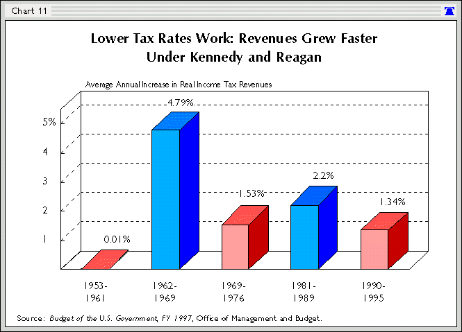
This is followed by a much longer analysis that corrects the numbers for inflation and looks at a number of other factors. In any case, the above chart in Dr. Mitchell's paper is followed by the following chart:

Dr. Daniel Mitchell Chart 11

I wrote the following about this chart in 2005:

Chart 11 is titled "Lower Tax Rates Work: Revenues Grew Faster Under Kennedy and Reagan" and shows the average annual increase in real income tax revenues for five time spans. I believe that the time span 1962-1969 was meant to be 1962-1968 as that most closely matches the budget numbers. The table below shows the numbers from the chart and my own calculations from the 1997 U.S. Budget.

First year...............  1953   1962   1969   1977   1981   1990
Last year................  1961   1968   1976   1980   1989   1995
Number of years in span..     9      7      8      4      9      6
Revenue Growth (chart 11)  0.01   4.79   1.53   ----   2.2    1.34
Revenue Growth (budget)..  0.11   4.67   1.55   7.48   2.19   1.56

In looking at Chart 11, the first glaring question is what in the world happened to the time span 1977-1980!? Is it missing because it had a 7.48% growth rate, very much confusing the issue? In addition, why are the time spans of varying lengths?

The reader continues:

Conservative site:

http://thedauntlessconservative.wordpress.com/2010/09/01/the-reagan-tax-cuts-lessons-for-tax-reform/ <--- this one I myself am a bit skeptic of but he/she does provide a lot of links

these are the videos they are a three series set about the Laffer Curve they also go into detail about the Reagan Tax Cuts (somewhat)

http://www.youtube.com/watch?v=fIqyCpCPrvU <--- the first video goes into detail mostly about the Laffer Curve theory but talks about Tax Cuts and some fantasies about them

http://www.youtube.com/watch?v=YsB_rnzBA08 <--- this one reviews Reagan's tax cuts more in depth though again not all that much but it's still worth looking into

the third video doesn't go into that much detail about the Tax cuts so i won't post it though if the links work then you should be able to find it rather easily in the "other videos" list

I haven't had a chance to look closely at the conservative blog that you mentioned and will do so if I get a chance. However, I noticed that it includes a similarly simplistic graph as the one above, showing the growth in receipts during the 80's without correcting for inflation or comparing the growth to other periods. I did watch the two videos you linked to and I noticed that both of them are narrated by our good friend, Daniel J. Mitchell, after he moved to the Cato Institute. His arguments seem similar to those that he made in the articles he wrote at Heritage. They tend to be simplistic and incomplete (some might say cherry-picked). In any case, I would not depend on him as your chief source.

The reader concludes:

I myself am not very familiar with economics I'm only 18 though from what I have learned Tax Cuts DO NOT always pay for themselves but there are arguable examples of them doing so (i.e Reagan tax cuts) personally I think tax cuts only pay for themselves when the cut goes from 70 to 28 like it did with Reagan or when it goes from some obscenely high rate to a low rate regardless these are my sources if I find more I'll post them

As I said in my analysis of the Kennedy tax cut, "it would seem possible that Kennedy's tax cut was beneficial, at least in reducing this oppressive top marginal rate but that Reagan's tax cuts took the marginal rates to a level where the negative effects far outweighed any positive effects". Hence, I would say that the tax cut from 91 to 70 percent under Kennedy may have had overall beneficial effects. The data as I can read it is not clear on whether or not this tax cut lost revenue. However, a Washington Post article titled "Where does the Laffer curve bend?" asked a number of economists and most of them estimated the bend point to be between 50 and 70 percent. So if one accepts the simplicity of the Laffer curve, a tax cut to a rate above the bend point would increase revenue but a tax cut below that bend point would lose revenue. Of course, as suggested by the post to which you replied, there are likely other factors involved and the Laffer curve, while possibly a useful concept, is overly simplistic.

Note: There is a discussion of this post at this link.

Monday, February 18, 2013

Do Tax Cuts Increase Economic Growth?

On January 30th, the Bureau of Economic Analysis issued its initial estimates of the real gross domestic product in the fourth quarter of 2012. Following is the beginning of the accompanying news release:

Real gross domestic product -- the output of goods and services produced by labor and property located in the United States -- decreased at an annual rate of 0.1 percent in the fourth quarter of 2012 (that is, from the third quarter to the fourth quarter), according to the "advance" estimate released by the Bureau of Economic Analysis. In the third quarter, real GDP increased 3.1 percent.

The Bureau emphasized that the fourth-quarter advance estimate released today is based on source data that are incomplete or subject to further revision by the source agency (see the box on page 4 and the "Comparisons of Revisions to GDP" on page 5). The "second" estimate for the fourth quarter, based on more complete data, will be released on February 28, 2013.

The release goes on to describe the components that contributed to the decrease:

The decrease in real GDP in the fourth quarter primarily reflected negative contributions from private inventory investment, federal government spending, and exports that were partly offset by positive contributions from personal consumption expenditures (PCE), nonresidential fixed investment, and residential fixed investment. Imports, which are a subtraction in the calculation of GDP, decreased.

The BEA also released an updated spreadsheet containing the annual GDP figures since 1929 and quarterly GDP figures since 1947. The following graph shows the change in the annual real GDP figures since 1940:

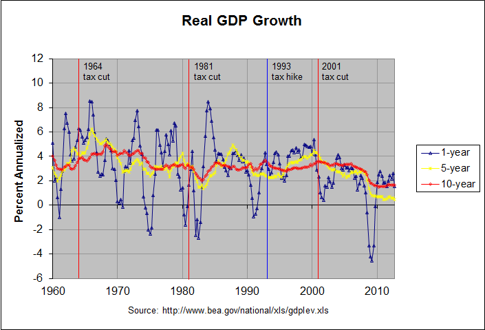
The actual numbers and sources for this and the following graph can be found at this link. The blue line shows the yearly change in the annual real GDP and the yellow and red lines show the 5-year and 10-year annualized changes, respectively. The following graph shows the change in the quarterly real GDP figures since 1960:

As before, the blue, yellow, and red lines show the 1-year, 5-year, and 10-year annualized changes in the quarterly real GDP. As can be seen, the 1-year change is the most volatile, the 5-year annualized change is less so, and the 10-year annualized change is even less so. In fact, the graph shows that the 10-year annualized change was relatively stable from 1974 to 2008, remaining between 2 and 4 percent for that entire period. Much of that apparent stability was due to the fact that 10 years just happens to be close to the length of several of the past business cycles. Recall that the three recessions prior to 2008 were in 2001, 1990-91, and 1980-82. That pattern was broken by the deep recession of 2008-09.

In fact, it is instructive to look at GDP growth over entire business cycles. The following table shows real GDP growth over all business cycles (taken from trough to trough) since 1949 as determined by the National Bureau of Economic Research:

                            REAL GDP GROWTH BY BUSINESS CYCLE

                GDP       GDP    Last Quarter          Entire Cycle
           (billion  (billion  ---------------- --------------------------
            current   chained  Percent  Annual-     # of  Percent  Annual-  Prior
Year  Qtr  dollars)   2005 $)   Change     ized Quarters   Change     ized  Trough   Trough
----  ---  --------  --------  -------  -------  -------  -------  -------  ------  -------
1949    4     265.2    1838.7     -0.9     -3.7
1954    2     376.0    2306.4      0.1      0.5       18     25.4     5.17  1949q4   1954q2
1958    2     458.0    2534.5      0.6      2.5       16      9.9     2.39  1954q2   1958q2
1961    1     528.0    2816.9      0.6      2.4       11     11.1     3.92  1958q2   1961q1
1970    4    1052.7    4253.0     -1.1     -4.2       39     51.0     4.32  1961q1   1970q4
1975    1    1569.4    4791.2     -1.2     -4.8       17     12.7     2.84  1970q4   1975q1
1980    3    2785.2    5771.7     -0.2     -0.7       22     20.5     3.44  1975q1   1980q3
1982    4    3312.5    5866.0      0.1      0.3        9      1.6     0.72  1980q3   1982q4
1991    1    5880.2    7943.4     -0.5     -1.9       33     35.4     3.74  1982q4   1991q1
2001    4   10373.1   11370.0      0.3      1.4       43     43.1     3.39  1991q1   2001q4
2009    2   13885.4   12701.0     -0.1     -0.3       30     11.7     1.49  2001q4   2009q2
2012    4   15829.0   13647.6      0.0     -0.1       14      7.5     2.08  2009q2   2012q4*

* 2012, quarter 4 has not been identified as a trough. It is just the most recent quarter.
Some of the business cycles are arguably too short to provide meaningful data. The following table combines the shorter business cycles to remedy this:
                REAL GDP GROWTH BY BUSINESS CYCLE (shorter cycles combined)

                GDP       GDP    Last Quarter          Entire Cycle
           (billion  (billion  ---------------- --------------------------
            current   chained  Percent  Annual-     # of  Percent  Annual-  Prior
Year  Qtr  dollars)   2005 $)   Change     ized Quarters   Change     ized  Trough   Trough
----  ---  --------  --------  -------  -------  -------  -------  -------  ------  -------
1949    4     265.2    1838.7     -0.9     -3.7
1961    1     528.0    2816.9      0.6      2.4       45     53.2     3.86  1949q4   1961q1
1970    4    1052.7    4253.0     -1.1     -4.2       39     51.0     4.32  1961q1   1970q4
1980    3    2785.2    5771.7     -0.2     -0.7       39     35.7     3.18  1970q4   1980q3
1991    1    5880.2    7943.4     -0.5     -1.9       42     37.6     3.09  1980q3   1991q1
2001    4   10373.1   11370.0      0.3      1.4       43     43.1     3.39  1991q1   2001q4
2009    2   13885.4   12701.0     -0.1     -0.3       30     11.7     1.49  2001q4   2009q2
2012    4   15829.0   13647.6      0.0     -0.1       14      7.5     2.08  2009q2   2012q4*

* 2012, quarter 4 has not been identified as a trough. It is just the most recent quarter.
As can be seen, the table now contains 5 groups from 1949 to 2001, each containing one or more full business cycles and being about 10 or 11 years in length. This is followed by the span from 2001 to 2009 which contains one full business cycle and is 7 and a half years in length. The final span from 2009 to present is not a full cycle since no ending trough has occurred. Still, the annualized growth in real GDP for these groups agree pretty much with the 10-year change seen in the graphs above. Real GDP growth from 1949 to 1970 was around 4 percent and was generally slightly above 3 percent from 1970 to 2001.

In the business cycle from 2001 to 2009, however, real GDP growth dropped to about 1.5 percent, less than half of its 1970 to 2001 rate. In the 3 and a half years since then, it's improved only slightly to about 2 percent. Since GDP growth tends to be better at the beginning of a business cycle, this will likely drop somewhat over the remainder of the cycle.

The second graph above shows the years of the three major tax cuts since 1960, the so-called Kennedy, Reagan, and Bush tax cuts. It also shows the so-called Clinton tax hike. As can be seen from the red line, these tax changes did not appear to cause any obvious changes in real GDP growth. Average GDP growth was perhaps a little higher following the Kennedy tax cuts. But, as mentioned, it was noticeably slower following the Bush tax cuts. Of course, there are all sorts of possible reasons for this slower GDP growth. Still, the data appears to provide no evidence that the Bush tax cuts served to increase real GDP growth.

Regarding the effect of taxes on growth, an article published on September 16th, 2012 in the Atlantic titled "Tax Cuts Don't Lead to Economic Growth, a New 65-Year Study Finds" begins as follows:

Here's a brief economic history of the last quarter-century in taxes and growth.

In 1990, President George H. W. Bush raised taxes, and GDP growth increased over the next five years. In 1993, President Bill Clinton raised the top marginal tax rate, and GDP growth increased over the next five years. In 2001 and 2003, President Bush cut taxes, and we faced a disappointing expansion followed by a Great Recession.

Does this story prove that raising taxes helps GDP? No. Does it prove that cutting taxes hurts GDP? No.

But it does suggest that there is a lot more to an economy than taxes, and that slashing taxes is not a guaranteed way to accelerate economic growth.

That was the conclusion from David Leonhardt's new column today for The New York Times, and it was precisely the finding of a new study from the Congressional Research Service, "Taxes and the Economy: An Economic Analysis of the Top Tax Rates Since 1945."

Following is the end of the summary given in the Congressional Research Service study:

Analysis of such data suggests the reduction in the top tax rates have had little association with saving, investment, or productivity growth. However, the top tax rate reductions appear to be associated with the increasing concentration of income at the top of the income distribution. The share of income accruing to the top 0.1% of U.S. families increased from 4.2% in 1945 to 12.3% by 2007 before falling to 9.2% due to the 2007-2009 recession. The evidence does not suggest necessarily a relationship between tax policy with regard to the top tax rates and the size of the economic pie, but there may be a relationship to how the economic pie is sliced.

Of course, there are some who disagree with this conclusion. David Leonhardt described Paul Ryan's response when asked to explain why a cut in tax rates would work better this time than last time as follows:

“I wouldn’t say that correlation is causation,” Mr. Ryan replied. “I would say Clinton had the tech-productivity boom, which was enormous. Trade barriers were going down in the Clinton years. He had the peace dividend he was enjoying.”

The economy in the Bush years, by contrast, had to cope with the popping of the technology bubble, 9/11, a couple of wars and the financial meltdown, Mr. Ryan continued. “Some of this is just the timing, not the person,” he said.

He then made an analogy. “Just as the Keynesians say the economy would have been worse without the stimulus” that Mr. Obama signed, Mr. Ryan said, “the flip side is true from our perspective.” Without the Bush tax cuts, that is, the worst economic decade since World War II would have been even worse.

Regarding timing, the table above shows that economic growth slowed markedly following the Bush tax cuts even when measured over full business cycles. And as described at this link, economic growth was subpar even before the financial meltdown. Still, Ryan is admitting that there are factors other than taxes that affect economic growth. For that reason, proponents of the idea that tax cuts increase economic growth need to provide strong evidence of that contention. It certainly is not apparent in the data above.

Note: There is a discussion of this post at this link.

Saturday, January 26, 2013

Did the Assault Weapons Ban Work? (Part 2)

Did the Assault Weapons Ban Work? (Part 2)

As mentioned in a prior post, David Kopel, a professor at the University of Denver, was on the December 17th edition of The PBS Newshour. Regarding the assault weapons ban, he said the following:

Well, I think we can look at what happened when she had her 10-year in the past. The Congress, when it enacted that ban, also ordered that a formal study be done of the results of it.

The study was performed by the Urban Institute, a very well-respected, somewhat left-leaning think tank in Washington, D.C., and the Urban Institute reported that it had no effect on homicide rates. There was no statistically significant benefit in terms of saving lives.

As I described in the prior post, the Urban Institute study reached no such conclusion. In any event, David Kopel was back on the January 16th edition of The PBS Newshour during which he said the following:

Well, the Department of Justice conducted a study of the effectiveness of that ban, published it in 2004, after it had been in effect for nine years, and concluded it had done absolutely no good. No lives were saved. There weren't fewer shots fired in shoot-outs with police officers or anything else. So it was -- it's a proven failure.

Once again, Kopel is claiming that the official studies concluded that the assault weapon ban did "absolutely no good". In fact, unlike Kopel, the studies were careful not to overstate their findings. Following is an excerpt from the first chapter of the 2004 study, titled "Impacts of the Federal Assault Weapons Ban, 1994-2003: Key Findings and Conclusions":

Should it be renewed, the ban’s effects on gun violence are likely to be small at best and perhaps too small for reliable measurement. AWs [assault weapons] were rarely used in gun crimes even before the ban. LCMs [large capacity magazines] are involved in a more substantial share of gun crimes, but it is not clear how often the outcomes of gun attacks depend on the ability of offenders to fire more than ten shots (the current magazine capacity limit) without reloading.

However, the study continues:

• Nonetheless, reducing criminal use of AWs and especially LCMs could have non-trivial effects on gunshot victimizations. The few available studies suggest that attacks with semiautomatics – including AWs and other semiautomatics equipped with LCMs – result in more shots fired, more persons hit, and more wounds inflicted per victim than do attacks with other firearms. Further, a study of handgun attacks in one city found that 3% of the gunfire incidents resulted in more than 10 shots fired, and those attacks produced almost 5% of the gunshot victims.

This does not sound like Kopel's claim that the study showed that 'no lives were saved" and that "there weren't fewer shots fired in shoot-outs with police officers or anything else". In any case, Kopel's broad claim that the study showed the ban to do "absolutely no good" is obviously false.

Kopel is not the only person to claim that the Assault Weapons Ban was proven to be ineffective without presenting the so-called proof. On January 24th, the same day that Senator Dianne Feinstein held a press conference to announce a new assault-weapons-ban proposal, Vice President Joe Biden held a "Fireside Hangout" to talk about reducing gun violence. The first question came from Philip DeFranco, an American video blogger and YouTube celebrity, who asked the following (about 3:20 into the video):

Mr Vice President, the 1994 Violent Crime Control and Law Enforcement Act, known as the Assault Weapons Ban, expired because it was proven to be ineffective at reducing violent crime...

Biden began his response by correctly pointing out that the Assault Weapons Ban "did not expire because it was proved ineffective, it expired because it had to be reauthorized in ten years" and that the "last administration chose not to seek reauthorization". Biden went on to assert that "there were fewer police being murdered, fewer police being outgunned when the assault weapons ban, in fact, was in existence". If true, this would contradict Kopel's assertion that "there weren't fewer shots fired in shoot-outs with police officers".

Near the end of the chat, Biden made some interesting comments about his concern for the dangers posed by assault weapons versus those posed by high-capacity gun magazines. A Huffington Post article summarized them as follows:

"More people out there get shot with a Glock that has cartridges in a [high-capacity magazines]," said Biden, chair of a White House task force to develop violence prevention proposals, during an online Google+ chat.

"I'm much less concerned, quite frankly, with what you'd call an 'assault weapon' than I am with magazines, and the number of rounds that can be held in a magazine." A Glock is a type of semi-automatic pistol.

I found these comments interesting in that they seemed to agree with some of the statements in the Key Findings and Conclusions chapter of the 2004 study. Following is an excerpt:

• AWs [assault weapons] were used in only a small fraction of gun crimes prior to the ban: about 2% according to most studies and no more than 8%. Most of the AWs used in crime are assault pistols rather than assault rifles.

• LCMs [large capacity magazines] are used in crime much more often than AWs and accounted for 14% to 26% of guns used in crime prior to the ban.

This agrees with Biden's suggestion that LCMs may be the bigger problem, at least in some ways. Following are two additional excerpts involving LCMs:

• However, the decline in AW use was offset throughout at least the late 1990s by steady or rising use of other guns equipped with LCMs in jurisdictions studied (Baltimore, Milwaukee, Louisville, and Anchorage). The failure to reduce LCM use has likely been due to the immense stock of exempted pre-ban magazines, which has been enhanced by recent imports.

...

• Restricting the flow of LCMs into the country from abroad may be necessary to achieve desired effects from the ban, particularly in the near future.

Hence, not only does the 2004 study not claim to prove that the assault weapons ban was ineffective, it makes suggestions as to how to make it more effective. It would seem reasonable to try implementing those suggestions and seeing if the ban can be made more effective. In any event, we should ignore claims of proof by people like Kopel and DeFranco unless and until that proof is presented.

Note: There is a discussion of this post at this link.

Friday, January 11, 2013

Wages, Productivity and Corporate Profits

On November 29th, the Bureau of Economic Analysis released the preliminary estimate of corporate profits for the 3rd quarter of 2012 (a revised estimate was released on December 20th). Following that, a number of publications ran stories reporting that corporate profits had reached a record high while wages had fallen to a record low. For example, CNN Money ran an online story on December 4th. Following is an excerpt:

In the third quarter, corporate earnings were $1.75 trillion, up 18.6% from a year ago, according to last week's gross domestic product report. That took after-tax profits to their greatest percentage of GDP in history.

But the record profits come at the same time that workers' wages have fallen to their lowest-ever share of GDP.

"That's how it works," said Robert Brusca, economist with FAO Research in New York, who said there is a natural tension between profits and the cost of labor. "If one gets bigger, the other gets smaller."

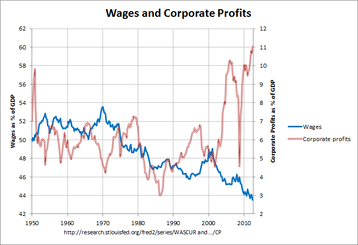
Many of the stories also included a graph which looked like the following:

Wages and Corporate Profits

The actual numbers and sources for this and the following graph can be found at this link. As can be seen, corporate profits are at their highest percentage of GDP since 1947 when this series began. Likewise wages and salary accruals are at their lowest percentage of GDP.

On a related topic, some other stories have pointed out a gap between the growth in productivity and real hourly compensation. For example, an August 10th Washington Post Wonkblog post stated the following:

The other part of Romney’s claim — that wages and employment track productivity — is actually false. Unpublished data from BLS, generously provided to me by the Economic Policy Institute’s Larry Mishel and Nicholas Finio, shows that wages tracked productivity growth until about 1970. After that, wages stagnated even as productivity continued to grow.

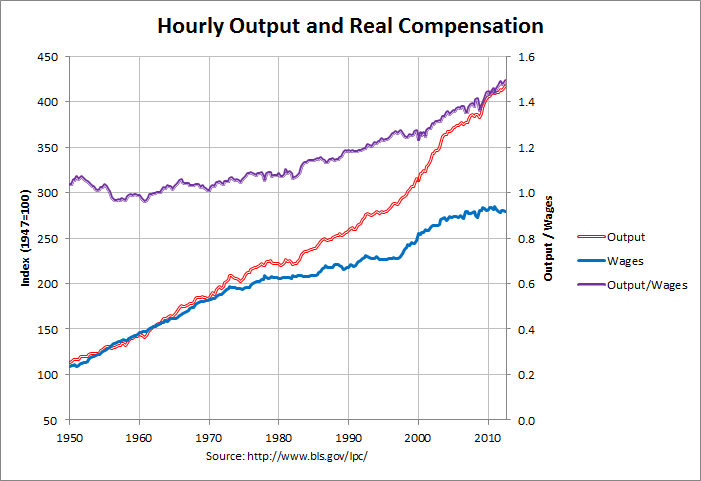
In fact the BLS (Bureau of Labor Statistics) has published data that shows this phenomena. This data was used to create the following graph:

Hourly Output and Real Compensation

The red line is labor productivity (output per hour) and the blue line is real hourly compensation, both for nonfarm business. The indices were obtained from the BLS web site as described at the bottom of this page and adjusted so that the base year (with a value of 100) was 1947 instead of 2005. As can be seen, real compensation closely tracked productivity until the early 1970s. Compensation did stagnate somewhat until the late nineties and, after about a decade of increased growth, has stagnated again. Productivity, however, stagnated only briefly in the mid seventies and early eighties and has grown briskly since then. This has caused an increasing gap between compensation and productivity.

This increasing gap is shown by the purple line which is the ratio of productivity to compensation. As can be seen, this ratio was fairly stable from 1950 to 1970, grew slowly until about 1982, and has grown fairly briskly since then.

In addition, this gap is addressed in a January 2011 essay in the Monthly Labor Review titled The compensation-productivity gap: a visual essay. That essay looks at the gap during several periods that contain multiple business cycles. The following table shows the annualized change in productivity, compensation, and their ratio for these periods using the data in the prior graph. It also shows the average annual values wages and corporate profits for these periods using the data in the first graph.

              Annual Average       Annualized Change (percent)
           --------------------  -------------------------------
                                                 Real    Produc-
             Wages &  Corporate      Labor     Hourly   tivity /
              Salary    Profits    Produc-    Compen-    Compen-
    Years*  Accruals  After Tax     tivity     sation     sation
---------  ---------  ---------  ---------  ---------  ---------
1947-1973      51.42       6.18       2.73       2.53       0.20
1973-1979      49.66       6.50       1.26       0.91       0.35
1979-1990      47.74       4.47       1.42       0.55       0.86
1990-2000      46.83       5.64       2.27       1.58       0.68
2000-2012      45.62       8.15       2.18       0.75       1.42
As can be seen, productivity did ease up a bit in the seventies and eighties but remained above 1 percent per year even during these periods. Compensation, however, was below 1 percent per year during the 70's and 80's and since 2000. This has caused the compensation-productivity gap to widen fairly quickly since 1979.

The aforementioned essay goes into more detail on some of the causes of this widening gap. Following is an excerpt from that essay:

There are two components that account for the gap between real hourly compensation growth and productivity growth. The first is the difference between the price indexes used to account for inflation in the BLS productivity and hourly compensation measures. The second is the change in “labor share,” which, as explained earlier, is the share of output that is accounted for by workers’ wages, salaries, and benefits.

Before 2000, the difference between the growth rates of the CPI and the IPD—that is, the difference in inflation rates—explained most of the gap in each period. For 2000 to 2009, an unprecedented decline in labor share accounted for most of the gap.

The underlying causes and significance of these two factors are debatable and require further study. What is clear, however, is that wages have been under pressure since the 1970's and this pressure is not explained by a lack of productivity or corporate profits.

Note: There is a discussion of this post at this link.

About Me

I became interested in U.S. budget and economic matters back in 1992, the first time that I remember the debt becoming a major issue in a presidential election. Along with this blog, I have a website on the subject at http://www.econdataus.com/budget.html. I have blogged further about my motivations for creating this blog and website at this link. Recently, I've been working on replicating studies such as the analysis at this link.

Contact Form

Name

Email *

Message *