On November 21st, the Wall Street Journal ran an editorial titled
"Higher Taxes Won't Reduce the Deficit ". The authors of the editorial are Stephen Moore and Richard Vedder. Moore is listed as a senior economics writer for The Wall Street Journal editorial page and Vedder is listed as a professor of economics at Ohio University and an adjunct scholar at the American Enterprise Institute. The editorial begins by mentioning that the draft recommendations of the president's commission on deficit reduction and a plan put forward by Alice Rivlin have proposed taxes as a part of reducing the deficit. It continues:
The claim here, echoed by endless purveyors of conventional wisdom in Washington, is that these added revenues—potentially a half-trillion dollars a year—will be used to reduce the $8 trillion to $10 trillion deficits in the coming decade. If history is any guide, however, that won't happen. Instead, Congress will simply spend the money.
In the late 1980s, one of us, Richard Vedder, and Lowell Gallaway of Ohio University co-authored a often-cited research paper for the congressional Joint Economic Committee (known as the $1.58 study) that found that every new dollar of new taxes led to more than one dollar of new spending by Congress. Subsequent revisions of the study over the next decade found similar results.
An initial problem that I have with the editorial is that it does not provide a link to the study or any of its subsequent revisions. I am very leery of any article that does not make it as easy as possible to check its sources. I make a point of giving all of my sources on
my website and
my blog. At most, such an article might motivate me go out and search for the data myself.
I was able to eventually find what appears to be a 1991 version of the study at
this link, subtitled "The $1.59 Study". Note that this is one penny different from "the $1.58 study" cited in the editorial. This appears to have been an honest mistake because the paper contains the following endnote:
8. In 1987, we reported a $1.58 coefficient on the tax variable. Incorporating some data revisions to some variables, we now obtain a coefficient of $1.50 using the 1947-86 period, but the reported $1.59 using the 1947-90 period, suggesting the additional years strengthened the positive tax-spend deficit relationship.
Still, this mistake did have that effect of making it difficult to find the paper since googling "$1.59 Study" found the paper immediately but googling the "$1.58 Study" cited by the editorial did not. In any event, I took a quick look at the paper and noticed a couple of points. Graph 1 shows the estimated spending associated with each $1.00 increase in taxes for the four time spans. The following table summarizes that data:
time span  Estimated Spending per $1.00 Increase in Taxes
---------  ----------------------------------------------
1791-1825  -$0.03
1826-1860  +$0.20
1867-1913  +$0.72
1947-1990  +$1.59
As can be seen, the $1.59 figure is associated with just the last period of 1947 to 1990. The final sentences of the paper's conclusion refer to fact, stating the following:
Historically, there was a time when tax increases meant deficit reduction, but that time passed in the early part of this century. State and local governments still are able to constrain spending increases to levels equal to or less than the taxes raised. Why? We would tentatively suggest that the answer may lie in different institutional constraints, such as balanced budget amendments, spending limitation amendments, line-item vetoes, etc., measures that lower the marginal political benefits of new spending to political decisionmakers. In any case, the Federal fiscal problem is not likely to be solved without significant behavioral change on the part of those decisionmakers, and those changes are not likely given the current system of political rewards and costs.
The following graph shows the growth of spending from 1950 to 1990.
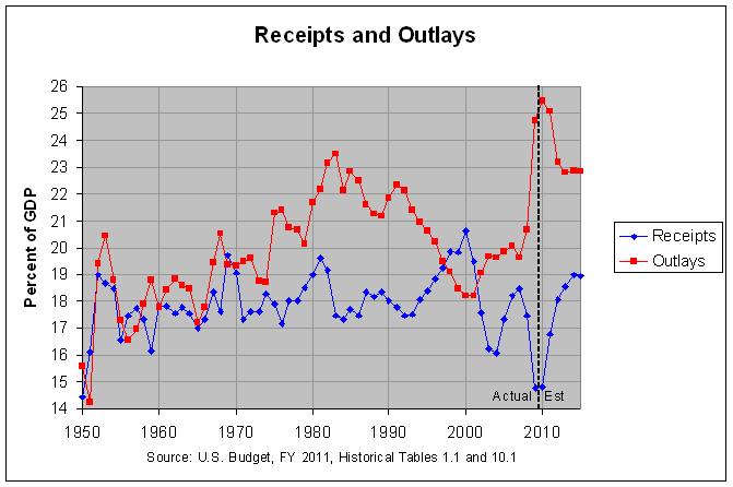
The actual numbers and sources for this graph can be found at
this link. The graph and actual numbers show that, as a percentage of GDP, spending was generally increasing for 1947 through 1983, nearly all of the period in question. However, spending as a percentage of GDP dropped steadily from 1991 through 2000. I was unable to find one of the cited revisions to this study which might address this period. However, the editorial itself states the following:
Our research indicates this is a sucker play. After the 1990 and 1993 tax increases, federal spending continued to rise. The 1990 tax increase deal was enacted specifically to avoid automatic spending sequestrations that would have been required under the then-prevailing Gramm-Rudman budget rules.
The statement that "federal spending continued to rise" is highly misleading. As shown in the graph above, federal spending as a percent of GDP (the red line) sank sharply from 1991 through 2000. The first table at the
following link shows that spending did rise measured in current dollars. However, any good economist would at least correct those numbers for inflation and likely population growth, if not GDP. The following table shows federal outlays in current and inflation-adjusted (FY 2005) dollars from 1990 through 2009.
       FEDERAL OUTLAYS (dollar amounts in billions)

            Actual Amount             Percent Change
      -------------------------  -------------------------
      Current  FY 2005  Percent  Current  FY 2005  Percent
Year  Dollars  Dollars   of GDP  Dollars  Dollars   of GDP
----  -------  -------  -------  -------  -------  -------
1990    1,253    1,832     21.9      9.6      6.3      3.3
1991    1,324    1,849     22.3      5.7      0.9      1.8
1992    1,382    1,858     22.1      4.3      0.5     -0.9
1993    1,409    1,846     21.4      2.0     -0.7     -3.2
1994    1,462    1,879     21.0      3.7      1.8     -1.9
1995    1,516    1,897     20.6      3.7      0.9     -1.9
1996    1,561    1,907     20.2      2.9      0.5     -1.9
1997    1,601    1,916     19.5      2.6      0.5     -3.5
1998    1,653    1,959     19.1      3.2      2.2     -2.1
1999    1,702    1,990     18.5      3.0      1.6     -3.1
2000    1,789    2,041     18.2      5.1      2.6     -1.6
2001    1,863    2,073     18.2      4.1      1.6      0.0
2002    2,011    2,201     19.1      7.9      6.2      4.9
2003    2,160    2,304     19.7      7.4      4.7      3.1
2004    2,293    2,378     19.6      6.2      3.2     -0.5
2005    2,472    2,472     19.9      7.8      4.0      1.5
2006    2,655    2,564     20.1      7.4      3.7      1.0
2007    2,729    2,565     19.6      2.8      0.1     -2.5
2008    2,983    2,704     20.7      9.3      5.4      5.6
2009    3,518    3,186     24.7     17.9     17.8     19.3

Source: Budget of the United States Government, FY 2011: Historical Table 1.3
As can be seen, outlays in FY 2005 dollars went up very slowly during this period. In fact, they went down from 1992 to 1993, reaching a level below their 1991 level. If they had also been corrected for population growth, they would have likely gone down over a much longer period. In any case, the editorial continues:
The only era in modern times that the budget has been in balance was in the late 1990s, when Republicans were in control of Congress. Taxes were not raised, and the capital gains tax rate was cut in 1997. The growth rate of federal spending was dramatically reduced from 1995-99, and the economy roared.
Of course, a dramatic reduction beginning in 1995 could not be due to a capital gains tax cut in 1997. The most recent tax change before 1995 was the 1993 tax
hike. In addition, the above table shows the growth rate of federal spending over this period. As can be seen, the growth rate reached its minimum in 1993 and stayed low until 2000. Spending then began to rise sharply, even as a percentage of GDP, through 2009. Most of this was following the Bush tax cuts of 2001 through 2003. Hence, tax cuts don't appear to restrain growth in spending. This would suggest that growth in spending is largely independent of tax hikes and tax cuts.
For the above reasons, I find the Wall Street Journal editorial to be less than credible. At best, it suggests that we need to make a conscious effort to restrain spending, just as we did during the nineties.