Budget of the United States Government for Fiscal Year 2011
On February 1, the U.S. Budget for fiscal year 2011 was released. Regarding the deficit, a Reuters article from that day stated the following:
The budget forecast a $1.56 trillion deficit in 2010, or 10.6 percent of gross domestic product (GDP), up from a 9.9 percent share of GDP in 2009.
But the shortfall was forecast to shrink to 8.3 percent of GDP in 2011. By the time his term ends in January 2013, it would have halved from the level Obama inherited on taking office last year, keeping a key pledge. That supposes Obama gets Congress to agree to spending cuts and that the economy rebounds strongly enough to sharply lift tax revenues.
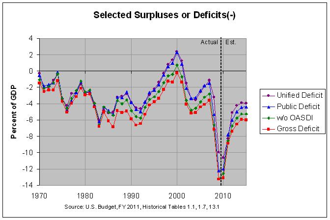
The following graph shows selected measures of the deficit since 1970:

The actual numbers and sources can be found at this link. As can be seen, the numbers in the Reuters article are for the "unified deficit", shown in purple in the graph. The unified deficit is usually very close to the change in the debt held by the public (labelled "public deficit" in the graph above). As can be seen, however, they differ a fair amount in 2009 and 2010 with the "public deficit" reaching about 12 percent of GDP in those years. The reason for this difference is described on page 59 of the Analytical Perspectives from the 2011 Budget as follows:
In 2009 the deficit was $1,413 billion while these other factors—primarily the net disbursements of credit financing accounts—increased the need to borrow by $329 billion. As a result, the Government borrowed $1,742 billion from the public. The other factors are estimated to increase borrowing by $197 billion in 2010 and reduce borrowing by $66 billion in 2011. In 2012–2020, these other factors are expected to increase borrowing by annual amounts ranging from $59 billion to $145 billion.
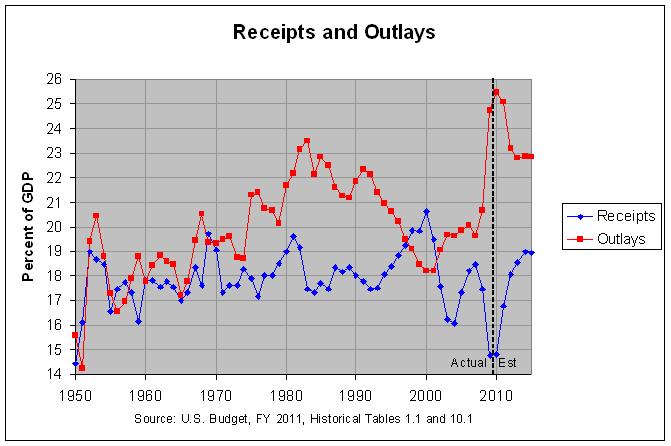
In any event, the unified deficit equals federal receipts minus federal outlays. The following graph shows federal receipts and outlays since 1950:

As before, the actual numbers and sources can be found at this link. One thing that is very noticeable in the above graph is that outlays are projected to increase from about 20 percent of GDP from 2003 through 2007 to about 23 percent of GDP from 2012 through 2015. The following table shows the projected change in outlays by function over the eight years from 2007 to 2015. For comparison, it also shows the actual change in outlays by function over the prior eight-year span from 1999 to 2007.
As can be seen, the functions with the largest projected increases in outlays are Net interest, Medicare, Social security, Allowances, and Health with increases of 1.3, 0.7, 0.5, 0.4, and 0.3 percent of GDP, respectively. In fact, these five functions could be said to account for the full 3.2 percent of GDP increase in all federal outlays with the other functions pretty much canceling each other out.
In any case, the projected 1.3 percent of GDP increase in Net interest follows a 0.8 percent of GDP decrease in the prior eight years. Hence, the increase in Net interest is likely due in part to a return to more normal interest rates and in part to an increase in the debt.
Medicare and Health (which consists chiefly of Medicaid) are projected to see a combined increase of about 1.0 percent of GDP from 2007 through 2015. This follows a combined increase of about 1.0 percent of GDP in the prior eight years. Social Security, on the other hand, is projected to increase by about 0.5 percent of GDP from 2007 through 2015. This follows no increase in the prior eight years. Table 5-1 on page 47 of the Analytical Perspectives from the 2011 Budget shows that Medicare and Medicaid are projected to continue growing as a percentage of GDP through 2085. Social Security, however, is projected to stabilize at about 5 percent of GDP after about 2010.
Finally, Allowances is projected to increase 0.4 percent of GDP from 2007 through 2015 when there was no increase in the prior eight years. Table 3.2 in the Historical Tables shows that the great majority of this increase in allowances is for Health Reform, chiefly in 2015.
Hence, the above table shows that the great majority of the increase in outlays that is projected through 2015 falls in two areas. The first area is entitlements, driven chiefly by health care costs but, to a lesser extent, by Social Security. The second area is Net interest. Since interest is pretty much an unavoidable cost, this suggests that the chief focus needs to be on the rise in the cost of health care and other entitlements. One-time increases in outlays, such as the 0.5 percent of GDP projected for Social Security, can likely be addressed by some combination of limiting the increase in outlays and increasing the revenues to pay for those outlays. On the other hand, continuing increases in outlays, such as those projected for health care costs, likely need to be addressed chiefly by limiting those continuing increases. This is especially the case for Medicare which is projected to increase from 3.1 percent of GDP in 2010 to 22 percent of GDP in 2085. Depending on ever-increasing revenues and/or cuts in other outlays to pay for such a large increase does not seem like a viable option.
The budget forecast a $1.56 trillion deficit in 2010, or 10.6 percent of gross domestic product (GDP), up from a 9.9 percent share of GDP in 2009.
But the shortfall was forecast to shrink to 8.3 percent of GDP in 2011. By the time his term ends in January 2013, it would have halved from the level Obama inherited on taking office last year, keeping a key pledge. That supposes Obama gets Congress to agree to spending cuts and that the economy rebounds strongly enough to sharply lift tax revenues.
The following graph shows selected measures of the deficit since 1970:

The actual numbers and sources can be found at this link. As can be seen, the numbers in the Reuters article are for the "unified deficit", shown in purple in the graph. The unified deficit is usually very close to the change in the debt held by the public (labelled "public deficit" in the graph above). As can be seen, however, they differ a fair amount in 2009 and 2010 with the "public deficit" reaching about 12 percent of GDP in those years. The reason for this difference is described on page 59 of the Analytical Perspectives from the 2011 Budget as follows:
In 2009 the deficit was $1,413 billion while these other factors—primarily the net disbursements of credit financing accounts—increased the need to borrow by $329 billion. As a result, the Government borrowed $1,742 billion from the public. The other factors are estimated to increase borrowing by $197 billion in 2010 and reduce borrowing by $66 billion in 2011. In 2012–2020, these other factors are expected to increase borrowing by annual amounts ranging from $59 billion to $145 billion.
In any event, the unified deficit equals federal receipts minus federal outlays. The following graph shows federal receipts and outlays since 1950:

As before, the actual numbers and sources can be found at this link. One thing that is very noticeable in the above graph is that outlays are projected to increase from about 20 percent of GDP from 2003 through 2007 to about 23 percent of GDP from 2012 through 2015. The following table shows the projected change in outlays by function over the eight years from 2007 to 2015. For comparison, it also shows the actual change in outlays by function over the prior eight-year span from 1999 to 2007.
     CHANGE IN OUTLAYS AS PERCENTAGE OF GDP

Superfunction and Function   1999-2007  2007-2015
---------------------------  ---------  ---------
National defense...........     1.0       -0.4
Human resources............     1.2        2.0
  Education, training, etc.     0.1        0.0
  Health...................     0.4        0.3
  Medicare.................     0.6        0.7
  Income security..........     0.0        0.2
  Social security..........     0.0        0.5
  Veterans benefits........     0.1        0.2
Physical resources.........     0.1       -0.3
Net interest...............    -0.8        1.3
Other functions............    -0.1        0.6
  International affairs....     0.0        0.2
  General science..........     0.0        0.0
  Agriculture..............    -0.1        0.0
  Administration of justice     0.0        0.0
  General government.......     0.0        0.0
  Allowances...............     0.0        0.4
Undistributed receipts.....    -0.2        0.1
Total, Federal outlays.....     1.2        3.2

Source: U.S. Budget, FY 2011, Historical Tables,
        tables 3.1 and 10.1
As can be seen, the functions with the largest projected increases in outlays are Net interest, Medicare, Social security, Allowances, and Health with increases of 1.3, 0.7, 0.5, 0.4, and 0.3 percent of GDP, respectively. In fact, these five functions could be said to account for the full 3.2 percent of GDP increase in all federal outlays with the other functions pretty much canceling each other out.
In any case, the projected 1.3 percent of GDP increase in Net interest follows a 0.8 percent of GDP decrease in the prior eight years. Hence, the increase in Net interest is likely due in part to a return to more normal interest rates and in part to an increase in the debt.
Medicare and Health (which consists chiefly of Medicaid) are projected to see a combined increase of about 1.0 percent of GDP from 2007 through 2015. This follows a combined increase of about 1.0 percent of GDP in the prior eight years. Social Security, on the other hand, is projected to increase by about 0.5 percent of GDP from 2007 through 2015. This follows no increase in the prior eight years. Table 5-1 on page 47 of the Analytical Perspectives from the 2011 Budget shows that Medicare and Medicaid are projected to continue growing as a percentage of GDP through 2085. Social Security, however, is projected to stabilize at about 5 percent of GDP after about 2010.
Finally, Allowances is projected to increase 0.4 percent of GDP from 2007 through 2015 when there was no increase in the prior eight years. Table 3.2 in the Historical Tables shows that the great majority of this increase in allowances is for Health Reform, chiefly in 2015.
Hence, the above table shows that the great majority of the increase in outlays that is projected through 2015 falls in two areas. The first area is entitlements, driven chiefly by health care costs but, to a lesser extent, by Social Security. The second area is Net interest. Since interest is pretty much an unavoidable cost, this suggests that the chief focus needs to be on the rise in the cost of health care and other entitlements. One-time increases in outlays, such as the 0.5 percent of GDP projected for Social Security, can likely be addressed by some combination of limiting the increase in outlays and increasing the revenues to pay for those outlays. On the other hand, continuing increases in outlays, such as those projected for health care costs, likely need to be addressed chiefly by limiting those continuing increases. This is especially the case for Medicare which is projected to increase from 3.1 percent of GDP in 2010 to 22 percent of GDP in 2085. Depending on ever-increasing revenues and/or cuts in other outlays to pay for such a large increase does not seem like a viable option.
Comments
Post a Comment